-
まずはインポート
using GLMakie # Jupyter notebook上に表示するのであればinline = trueとし、 # 別のウインドウを立ち上げるのであればinline = falseとする # 対話型、3次元グラフ、アニメーションの場合はinline = falseが基本 GLMakie.activate!(inline = true) # フォントサイズを変えたい場合や日本語を使いたい場合 set_theme!( fontsize = 32, fonts = (regular = "Noto Sans CJK JP", bold = "Noto Sans CJK JP") ) -
グラフの基本
                # 描画領域の確保
                fig = Figure()

                # 軸の確保
                # fig[1,1]とは1行1列目のグラフ、という意味
                # 複数のグラフを並べるときに重要 (後述)
                ax = Axis(fig[1,1])

                # 軸に折れ線グラフを描く
                # 折れ線グラフはlines!で、散布図はscatter!
                # 点と線を両方入れる場合はscatterlines!
                lines!(ax, [1;4;7], [2;5;1]) # (1,2),(4,5),(7,1)を繋ぐ折れ線グラフ

                # グラフの描画
                display(fig)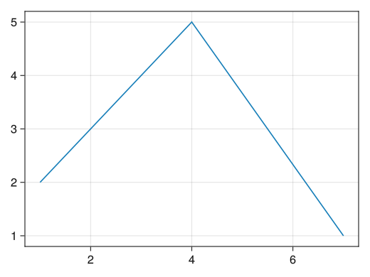
-
軸およびグラフに名前を付ける
                fig = Figure()

                # xlabelオプションでx軸に名前が付く
                # ylabelオプションでy軸に名前が付く
                # titleオプションでグラフに名前が付く
                ax = Axis(fig[1,1], xlabel = "x軸の名前", ylabel = "y軸の名前", title = "sin(x)のグラフ")

                x = collect(range(0, 2pi, length = 100))
                lines!(ax, x, sin.(x))

                display(fig)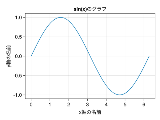
-
軸の範囲を設定する
                fig = Figure()

                ax = Axis(fig[1,1], xlabel = "x", ylabel = "sin(x)")

                x = collect(range(0, 2pi, length = 100))
                lines!(ax, x, tan.(x))

                # xlims!でx軸の範囲を指定できる
                # ylims!でy軸の範囲を指定できる
                # 上限または下限のみを指定したい場合は、もう片方をnothingとする
                xlims!(ax, 0, pi)
                ylims!(ax, -5, 5)

                display(fig)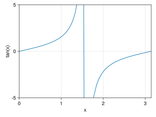
-
軸の数値を設定する
                fig = Figure()

                # xticks!オプションでx軸に表示する数値を指定できる
                # yticks!オプションでy軸に表示する数値を指定できる
                ax = Axis(fig[1,1], xlabel = "x", ylabel = "sin(x)",
                    xticks = [0; pi/2; pi; 3pi/2; 2pi],
                    yticks = [-1; -0.5; 0; 0.5; 1])

                x = collect(range(0, 2pi, length = 100))
                lines!(ax, x, sin.(x))

                display(fig)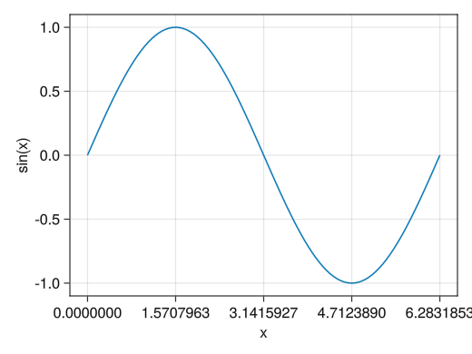
-
軸の数値を設定し、好きな表記にする
                fig = Figure()

                # x(y)ticks!オプションで2つのベクトルを()内に並べることによって
                # 指定した数値の表示を変えることができる
                # 2つのベクトルの要素数は同じでなければならない
                ax = Axis(fig[1,1], xlabel = "x", ylabel = "sin(x)",
                    xticks = ([0; pi/2; pi; 3pi/2; 2pi], ["0"; "π/2"; "π"; "3π/2"; "2π"]),
                    yticks = ([-1; 0; 1], ["ymin"; "0"; "ymax"]))

                x = collect(range(0, 2pi, length = 100))
                lines!(ax, x, sin.(x))

                display(fig)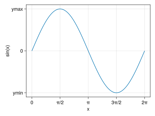
-
グリッドを消す
                fig = Figure()

                # x(y)gridvisible = falseでx(y)方向のグリッドを消せる
                ax = Axis(fig[1,1], xlabel = "x", ylabel = "sin(x)",
                    xticks = ([0; pi/2; pi; 3pi/2; 2pi], ["0"; "π/2"; "π"; "3π/2"; "2π"]),
                    yticks = ([-1; 0; 1], ["ymin"; "0"; "ymax"]),
                    xgridvisible = false,
                    ygridvisible = false)

                x = collect(range(0, 2pi, length = 100))
                lines!(ax, x, sin.(x))

                display(fig)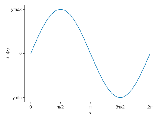
-
数値の入らないサブ目盛りを入れる
                fig = Figure()

                # x(y)minorticksvisible = trueでx(y)方向のサブ目盛りを表示できる
                # (対数グラフのところでも説明)
                # x(y)minorticksオプションで具体的なサブ目盛りの位置を指定することもできる
                # 具体的な数値を入れる代わりにIntervalsBetweenで目盛りと目盛りの間のサブ目盛りの数を指定できる
                ax = Axis(fig[1,1], xlabel = "x", ylabel = "sin(x)",
                    xticks = ([0; pi/2; pi; 3pi/2; 2pi], ["0"; "π/2"; "π"; "3π/2"; "2π"]),
                    yticks = ([-1; 0; 1], ["ymin"; "0"; "ymax"]),
                    xminorticksvisible = true,
                    yminorticksvisible = true)

                x = collect(range(0, 2pi, length = 100))
                lines!(ax, x, sin.(x))

                display(fig)
-
サブ目盛りに対するグリッドを入れる
                fig = Figure()

                # x(y)minorgridvisible = trueでx(y)方向のサブ目盛りに対するグリッドを表示できる (サブ目盛りを表示する必要がある)
                ax = Axis(fig[1,1], xlabel = "x", ylabel = "sin(x)",
                    xticks = ([0; pi/2; pi; 3pi/2; 2pi], ["0"; "π/2"; "π"; "3π/2"; "2π"]),
                    yticks = ([-1; 0; 1], ["ymin"; "0"; "ymax"]),
                    xminorticksvisible = true,
                    yminorticksvisible = true,
                    xminorticks = IntervalsBetween(4),
                    xminorgridvisible = true,
                    yminorgridvisible = true)

                x = collect(range(0, 2pi, length = 100))
                lines!(ax, x, sin.(x))

                display(fig)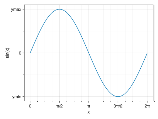
-
x軸とy軸の長さと数値の割合を同じにする
                fig = Figure()

                # aspect = DataAspect()オプションで、縦と横の数値の比率が同じになる
                ax = Axis(fig[1,1], aspect = DataAspect())

                x = collect(range(0, 2pi, length = 100))
                lines!(ax, x, sin.(x))

                display(fig)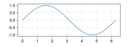
-
x軸とy軸の長さを同じにする
                fig = Figure()

                # aspect = AxisAspect(1)オプションで、縦と横の軸の長さが同じになる
                ax = Axis(fig[1,1], aspect = AxisAspect(1))

                x = collect(range(0, 2pi, length = 100))
                lines!(ax, x, sin.(x))

                display(fig)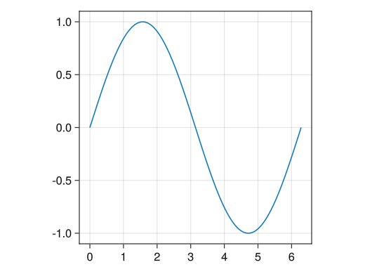
-
文字列にLaTeXを用いる
                fig = Figure()

                # 文字列の""の前にLを付けることによりLaTeXの表記が使えるようになる
                # ただしPythonPlotに比べて環境は貧弱で、日本語は使えず、フォントを変えることもできない
                # LaTeXで頑張るより特殊文字 (Unicode文字) で頑張る方が良いかも
                ax = Axis(fig[1,1], xlabel = L"$x$", ylabel = L"$\sin(x)$",
                    xticks = ([0; pi/2; pi; 3pi/2; 2pi], [L"0"; L"$\pi/2$"; L"$\pi$"; L"$3\pi/2$"; L"$2\pi$"]),
                    yticks = ([-1; 0; 1], [L"$y_\mathrm{min}$"; L"0"; L"$y_\mathrm{max}$"]))

                x = collect(range(0, 2pi, length = 100))
                lines!(ax, x, sin.(x))

                display(fig)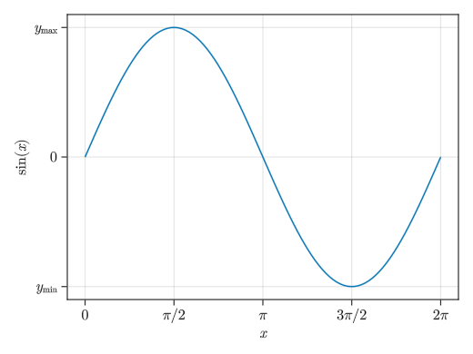
-
グラフのサイズ
                # resolutionオプションで描画領域のサイズを変えることができる
                # デフォルトのサイズはデスクトップ環境に依存する
                # (普通に動かしていれば800×600くらい)
                # (バージョンによってはresolutionの代わりにsizeを使えと言われるが、ほぼ同じ)
                fig = Figure(resolution = (400, 300))
                ax = Axis(fig[1,1])
                x = collect(range(0, 2pi, length = 100))
                lines!(ax, x, sin.(x))

                display(fig)
-
グラフの保存
                fig = Figure()
                ax = Axis(fig[1,1])
                x = collect(range(0, 2pi, length = 100))
                lines!(ax, x, sin.(x))

                # save("ファイル名", fig)でグラフの保存ができる
                # よく使う拡張子としてpngがある (拡張子で保存するファイルタイプを自動的に判断してくれる)
                # pdfでの保存はできない (GLMakieの代わりにCairoMakieが必要)
                save("graph.png", fig)
-
色, 太さ, 線種
                fig = Figure()
                ax = Axis(fig[1,1])
                x = collect(range(0, 2pi, length = 100))

                # linewidthオプションで線の太さ
                # colorオプションで線の色
                #  :red
                #  (:red, 0.5) : 柔らかめの赤
                # linestyleオプションで線の種類
                #  :dash : 破線
                #  :dot : 点線
                #  :dashdot : 一点鎖線
                lines!(ax, x, sin.(x), linewidth = 4, color = (:violet, 0.5), linestyle = :dashdot)

                display(fig)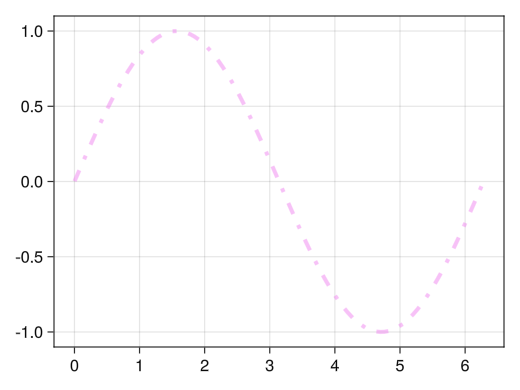
-
値に応じたグラデーション
                fig = Figure()
                ax = Axis(fig[1,1])
                x = collect(range(0, 2pi, length = 100))

                # colorにベクトルを指定することによってベクトルの値に対応したグラデーションが付く
                lines!(ax, x, sin.(x), color = sin.(x) .^ 2)

                display(fig)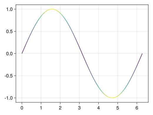
-
グラデーションのオプション
                fig = Figure()
                ax = Axis(fig[1,1])
                x = collect(range(0, 2pi, length = 100))

                # colormapオプションでグラデーションを変えられる
                #  :viridis : 青→黃のよく見るグラデーション
                #  :jet : 虹色グラデーション
                #  :hsv : 虹色周期グラデーション
                #  :bwr : 青白赤グラデーション
                #  :oranges : 白→オレンジグラデーション
                lines!(ax, x, sin.(x), color = sin.(x) .^ 2, colormap = :jet)

                display(fig)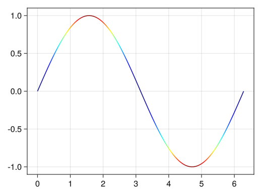
-
グラデーションをカラーバーで表示する
                fig = Figure()
                # 1行1列目にグラフ
                ax = Axis(fig[1,1])
                x = collect(range(0, 2pi, length = 100))

                # 折れ線グラフ自体を変数として代入 (今の場合はc_lineという変数)
                c_line = lines!(ax, x, sin.(x), color = sin.(x) .^ 2)

                # Colorbarでc_line用のカラーバーが1行2列目に追加される
                Colorbar(fig[1,2], c_line)

                display(fig)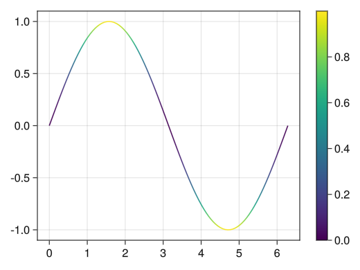
-
カラーバー (およびグラデーション) のオプション
                fig = Figure()
                ax = Axis(fig[1,1], xlabel = "x", ylabel = "sin(x)")
                x = collect(range(0, 2pi, length = 100))

                # colorrangeオプションで色に対する最大値、最小値を設定できる
                c_line = lines!(ax, x, sin.(x), color = sin.(x) .^ 2, colorrange = [0; 1])

                # ticksオプションで目盛りの数値を設定できる
                # labelオプションでカラーバーに名前を付けられる
                Colorbar(fig[1,2], c_line, ticks = [0; 0.5; 1], label = "sin²(x)")

                display(fig)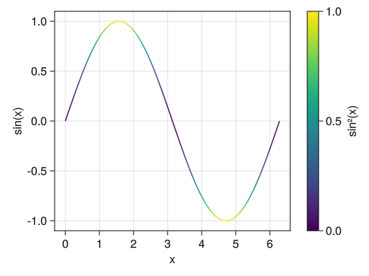
-
色, 大きさ, 点種
                fig = Figure()
                ax = Axis(fig[1,1], xlabel = "身長 [cm]", ylabel = "体重 [kg]")
                height = [172.3; 165; 179.6; 174.5; 173.8; 165.4; 164.5; 174.9; 166.8; 185]
                mass = [75.24; 55.8; 78; 71.1; 67.7; 55.4; 63.7; 77.2; 67.5; 84.6]

                # markersizeオプションで点の大きさ
                # colorオプションで点の色
                #  :red
                #  (:red, 0.5) : 柔らかめの赤
                # markerオプションで点の種類
                #  :circle : 円
                #  :utriangle : 三角形
                #  :dtriangle : 逆三角形
                #  :rect : 正方形
                scatter!(ax, height, mass, markersize = 25, color = (:blue, 0.5), marker = :rect)

                display(fig)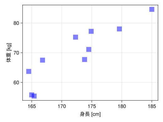
-
値に応じたグラデーション、サイズ、点種
                fig = Figure()
                ax = Axis(fig[1,1], xlabel = "身長 [cm]", ylabel = "体重 [kg]",
                    title = "マーカーサイズは年齢に対応、スコアは体力測定の結果")
                height = [172.3; 165; 179.6; 174.5; 173.8; 165.4; 164.5; 174.9; 166.8; 185]
                mass = [75.24; 55.8; 78; 71.1; 67.7; 55.4; 63.7; 77.2; 67.5; 84.6]
                fat = [21.3; 15.7; 20.1; 18.4; 17.1; 22; 32.2; 36.9; 27.6; 14.4]
                age = [27; 25; 31; 32; 28; 36; 42; 33; 54; 28]
                score = ['C'; 'A'; 'C'; 'B'; 'B'; 'B'; 'D'; 'B'; 'C'; 'B']

                # linesと同様にcolorにベクトルを指定してグラデーションにできる
                # markersizeにベクトルを指定して点ごとにサイズを変えられる
                # markerに単一文字 ("ではなく'で指定) を指定して点の代わりに文字にすることができる
                # さらにベクトルを指定すれば点ごとに点種を変えられる
                c_marker = scatter!(ax, height, mass, markersize = age, color = fat, marker = score)

                # linesと同様に、グラデーションに対するカラーバーを付けることもできる
                Colorbar(fig[1,2], c_marker, label = "体脂肪率 [%]")

                display(fig)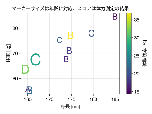
-
1つの軸に複数のグラフを描画する
                fig = Figure()
                ax = Axis(fig[1,1])
                x = collect(range(0, 2pi, length = 100))

                # linesやscatterを繰り返し使うことで1つの軸に複数のグラフを描画できる
                # 色は自動で変わる (勿論colorオプションで1つずつ指定できる)
                lines!(ax, x, sin.(x))
                lines!(ax, x, cos.(x))

                display(fig)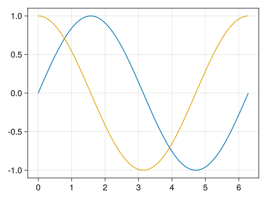
-
linesとscatterの混在
                fig = Figure()
                ax = Axis(fig[1,1])
                x1 = collect(range(0, 2pi, length = 100))
                x2 = collect(range(0, 2pi, length = 10))
                x3 = collect(range(0, 2pi, length = 15))

                # lines, scatter, scatterlinesを混在させることもできる
                # 色の管理はlines, scatter, scatterlinesで別なので注意
                lines!(ax, x1, sin.(x1))
                scatter!(ax, x2, cos.(x2))
                scatterlines!(ax, x3, tanh.(x3))

                display(fig)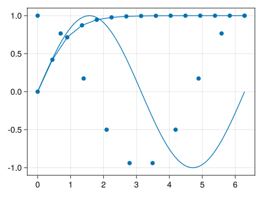
-
凡例の表示 (グラフ内)
                fig = Figure()
                ax = Axis(fig[1,1], xlabel = "x")
                x1 = collect(range(0, 2pi, length = 100))
                x2 = collect(range(0, 2pi, length = 10))
                x3 = collect(range(0, 2pi, length = 15))

                # グラフ自体を変数として代入
                li = lines!(ax, x1, sin.(x1), color = (:red, 0.5))
                sc = scatter!(ax, x2, cos.(x2), color = (:blue, 0.5))
                sl = scatterlines!(ax, x3, tanh.(x3), color = (:green, 0.5))

                # axislegendでlabelオプションで付けた名前を凡例として表示させる
                axislegend(ax, [li; sc; sl], ["sin(x)"; "cos(x)"; "tanh(x)"])

                display(fig)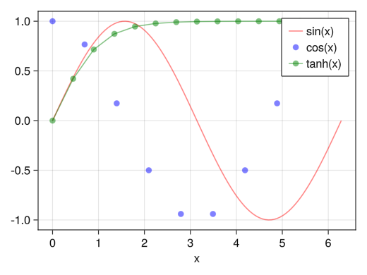
-
凡例の位置
                fig = Figure()
                ax = Axis(fig[1,1], xlabel = "x")
                x1 = collect(range(0, 2pi, length = 100))
                x2 = collect(range(0, 2pi, length = 10))
                x3 = collect(range(0, 2pi, length = 15))

                li = lines!(ax, x1, sin.(x1), color = (:red, 0.5))
                sc = scatter!(ax, x2, cos.(x2), color = (:blue, 0.5))
                sl = scatterlines!(ax, x3, tanh.(x3), color = (:green, 0.5))

                # positionオプションで位置を指定できる
                #  :rb → 右下
                #  :rt → 右上
                #  :rc → 右中央
                #  :lb → 左下
                #  :lt → 左上
                #  :lc → 左中央
                #  :cb → 中央下
                #  :ct → 中央上
                #  :cc → 中央
                axislegend(ax, [li; sc; sl], ["sin(x)"; "cos(x)"; "tanh(x)"], position = :lb)

                display(fig)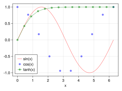
-
横並びの凡例
                fig = Figure()
                ax = Axis(fig[1,1], xlabel = "x")
                x1 = collect(range(0, 2pi, length = 100))
                x2 = collect(range(0, 2pi, length = 10))
                x3 = collect(range(0, 2pi, length = 15))

                li = lines!(ax, x1, sin.(x1), color = (:red, 0.5))
                sc = scatter!(ax, x2, cos.(x2), color = (:blue, 0.5))
                sl = scatterlines!(ax, x3, tanh.(x3), color = (:green, 0.5))

                # orientationa = :horizontalオプションで横並びになる
                axislegend(ax, [li; sc; sl], ["sin(x)"; "cos(x)"; "tanh(x)"], orientation = :horizontal)

                display(fig)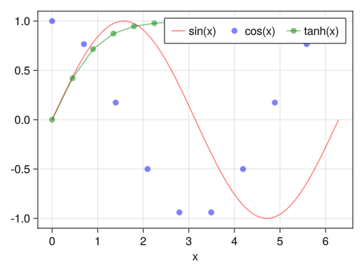
-
凡例の表示 (グラフ外)
                fig = Figure()
                ax = Axis(fig[1,1], xlabel = "x")
                x1 = collect(range(0, 2pi, length = 100))
                x2 = collect(range(0, 2pi, length = 10))
                x3 = collect(range(0, 2pi, length = 15))

                li = lines!(ax, x1, sin.(x1), color = (:red, 0.5))
                sc = scatter!(ax, x2, cos.(x2), color = (:blue, 0.5))
                sl = scatterlines!(ax, x3, tanh.(x3), color = (:green, 0.5))

                # Legendでグラフ外に凡例を表示させる
                # orientation = :horizontalも使える
                Legend(fig[1,2], [li; sc; sl], ["sin(x)"; "cos(x)"; "tanh(x)"])

                display(fig)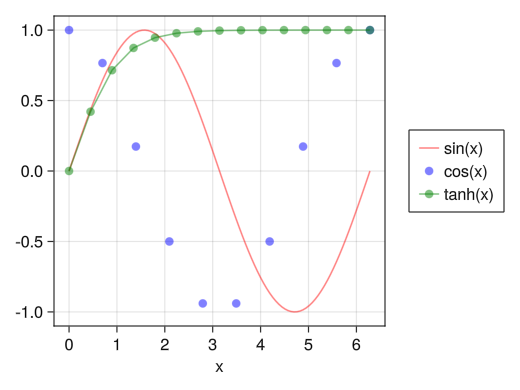
-
左右に異なるy軸
                fig = Figure()

                ax1 = Axis(fig[1,1], xlabel = "時刻 [s]", ylabel = "速度 [m/s]")

                # yaxisposition = :rightで右側の軸も使えるようになる
                ax2 = Axis(fig[1,1], ylabel = "高さ [m]", yaxisposition = :right)
                # 次の2行も入れておく
                hidespines!(ax2)
                hidexdecorations!(ax2)

                t = collect(range(0, 0.9, length = 100))

                # ax1とax2で色の管理が別なので注意
                lines!(ax1, t, 5 .- 9.8 * t, color = (:red, 0.5))
                lines!(ax2, t, - 4.9 * t .^ 2 + 5 * t, color = (:blue, 0.5))

                display(fig)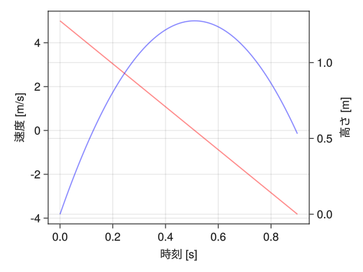
-
左右に異なるy軸 (凡例付きの例)
                fig = Figure(resolution = (720,390))

                ax1 = Axis(fig[1,1], xlabel = "時刻 [s]", ylabel = "速度 [m/s]")
                ax2 = Axis(fig[1,1], ylabel = "高さ [m]", yaxisposition = :right)
                hidespines!(ax2)
                hidexdecorations!(ax2)

                t = collect(range(0, 0.9, length = 100))

                v0 = lines!(ax1, t, 5 .- 9.8 * t, color = (:red, 0.5))
                vd = lines!(ax1, t, 24.6 * exp.(- t / 2) .- 19.6, color = (:blue, 0.5))
                s0 = lines!(ax2, t, - 4.9 * t .^ 2 + 5 * t, color = (:green, 0.5))
                sd = lines!(ax2, t, 49.2 * (1 .- exp.(- t / 2)) - 19.6 * t, color = (:orange, 0.5))

                Legend(fig[1,2], [v0; vd; s0; sd], ["速度 (摩擦なし) "; "速度 (摩擦あり) "; "高さ (摩擦なし) "; "高さ (摩擦あり) "])

                display(fig)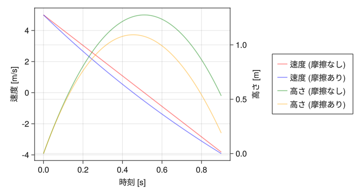
-
複数の軸
                # 複数の軸を描画するので描画領域の大きさを必ず設定しておく
                fig = Figure(resolution = (520 * 2 * 0.8, 390 * 3 * 0.8))
                x1 = collect(range(- pi, pi, length = 100))
                x2 = collect(range(-1, 1, length = 100))
                x3 = collect(range(-2, 2, length = 100))
                x4 = collect(range(1, 2, length = 100))

                # 1行1列目のグラフ
                ax = Axis(fig[1,1], xlabel = "x", title = "三角関数のグラフ")
                li1 = lines!(ax, x1, sin.(x1))
                li2 = lines!(ax, x1, cos.(x1))
                li3 = lines!(ax, x1, tan.(x1))
                ylims!(ax, -1.5, 1.5)
                Legend(fig[1,2], [li1; li2; li3], ["sin(x)"; "cos(x)"; "tan(x)"])

                # 1行2列目のグラフ
                ax = Axis(fig[1,3], xlabel = "x", title = "双曲線関数のグラフ")
                li1 = lines!(ax, x3, sinh.(x3))
                li2 = lines!(ax, x3, cosh.(x3))
                li3 = lines!(ax, x3, tanh.(x3))
                Legend(fig[1,4], [li1; li2; li3], ["sinh(x)"; "cosh(x)"; "tanh(x)"])

                # 2行1列目のグラフ
                ax = Axis(fig[2,1], xlabel = "x", title = "三角関数の逆数グラフ")
                li1 = lines!(ax, x1, 1 ./ sin.(x1))
                li2 = lines!(ax, x1, 1 ./ cos.(x1))
                li3 = lines!(ax, x1, 1 ./ tan.(x1))
                ylims!(ax, -10, 10)
                Legend(fig[2,2], [li1; li2; li3], ["csc(x)"; "sec(x)"; "cot(x)"])

                # 2行2列目のグラフ
                ax = Axis(fig[2,3], xlabel = "x", title = "双曲線関数の逆数グラフ")
                li1 = lines!(ax, x3, 1 ./ sinh.(x3))
                li2 = lines!(ax, x3, 1 ./ cosh.(x3))
                li3 = lines!(ax, x3, 1 ./ tanh.(x3))
                ylims!(ax, -4, 4)
                Legend(fig[2,4], [li1; li2; li3], ["csch(x)"; "sech(x)"; "coth(x)"])

                # 3行1列目のグラフ
                ax = Axis(fig[3,1], xlabel = "x", title = "逆三角関数のグラフ")
                li1 = lines!(ax, x2, asin.(x2))
                li2 = lines!(ax, x2, acos.(x2))
                li3 = lines!(ax, x3, atan.(x3))
                Legend(fig[3,2], [li1; li2; li3], ["asin(x)"; "acos(x)"; "atan(x)"])

                # 3行2列目のグラフ
                ax = Axis(fig[3,3], xlabel = "x", title = "逆双曲線関数のグラフ")
                li1 = lines!(ax, x3, asinh.(x3))
                li2 = lines!(ax, x4, acosh.(x4))
                li3 = lines!(ax, x2, atanh.(x2))
                Legend(fig[3,4], [li1; li2; li3], ["asinh(x)"; "acosh(x)"; "atanh(x)"])

                display(fig)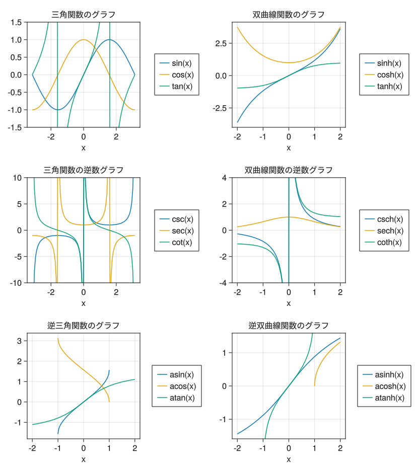
-
片対数グラフ
                fig = Figure()

                # yscale = log10で片対数グラフ (y軸が対数スケール) となる
                ax = Axis(fig[1,1], yscale = log10, xlabel = "x", ylabel = "5 exp(-2x)",
                    title = "片対数グラフでは指数関数が直線となる")

                x = collect(range(0, 5, length = 5))
                scatterlines!(ax, x, 5 * exp.(- 2 * x))

                display(fig)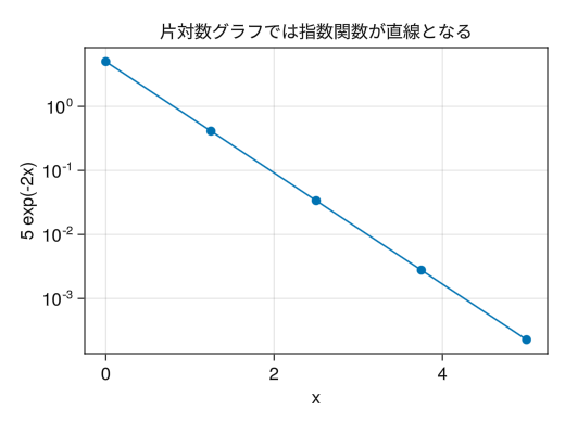
-
両対数グラフ
                fig = Figure()

                # xscale = log10を追加して両対数グラフ (x軸、y軸が対数スケール) となる
                ax = Axis(fig[1,1], xscale = log10, yscale = log10, xlabel = "x", ylabel = "10 x^(-5/3)",
                    title = "両対数グラフではべき関数が直線となる")

                x = collect(range(1, 100, length = 10))
                scatterlines!(ax, x, 10 * x .^ (- 5 / 3))

                display(fig)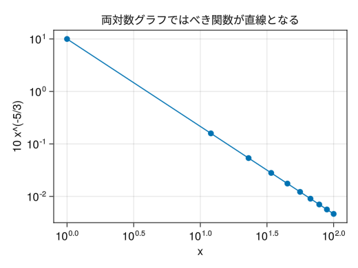
-
対数グラフのサブ目盛り
                fig = Figure()

                # PythonPlotと異なり、サブ目盛りがデフォルトで入らない
                # x(y)minorticksvisible = trueでサブ目盛りが入る
                # x(y)minorticks = IntervalBetweenでサブ目盛りの数を指定できる
                ax = Axis(fig[1,1], xscale = log10, yscale = log10, xlabel = "x", ylabel = "10 x^(-5/3)",
                    title = "両対数グラフではべき関数が直線となる",
                    xminorticksvisible = true, yminorticksvisible = true,
                    xminorticks = IntervalsBetween(10), yminorticks = IntervalsBetween(10))

                x = collect(range(1, 100, length = 10))
                scatterlines!(ax, x, 10 * x .^ (- 5 / 3))

                display(fig)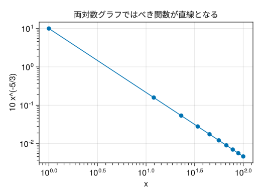
-
特殊な対数スケール
                fig = Figure()

                # PythonPlotと異なり、対数スケールに0や負数が入るとエラーとなる
                # (PythonPlotの場合はその点が無視されてプロットされる)
                # 妥協策として特殊な対数スケールMakie.pseudolog10が用意されている
                ax = Axis(fig[1,1], yscale = Makie.pseudolog10, xlabel = "x", ylabel = "x³",
                    yticks = [-100; -10; -1; 0; 1; 10; 100])

                x = collect(range(-5, 5, length = 100))
                lines!(ax, x, x .^ 3)

                display(fig)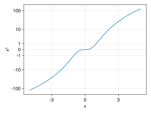
-
基本的なヒストグラム
                using Random
                using Dates
                rng = MersenneTwister(Millisecond(now()).value)

                fig = Figure()
                x = [randn(rng, 1000); 2.0 * randn(rng, 1000) .+ 5]

                ax = Axis(fig[1,1], xlabel = "x", ylabel = "頻度")

                # hist!(ax, ベクトル)でヒストグラムとなる
                hist!(x)

                display(fig)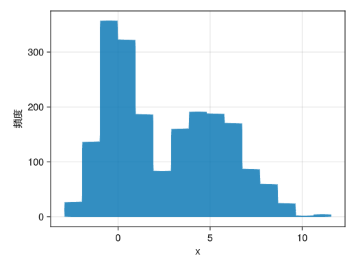
-
階級数を変える
                using Random
                using Dates
                rng = MersenneTwister(Millisecond(now()).value)

                fig = Figure()
                x = [randn(rng, 1000); 2.0 * randn(rng, 1000) .+ 5]

                ax = Axis(fig[1,1], xlabel = "x", ylabel = "頻度")

                # binsオプションで階級数を指定できる
                hist!(x, bins = 20)

                display(fig)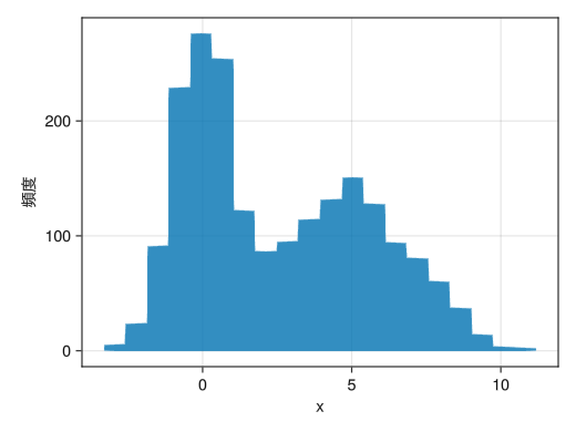
-
頻度ではなく確率分布にする
                using Random
                using Dates
                rng = MersenneTwister(Millisecond(now()).value)

                fig = Figure()
                x = [randn(rng, 1000); 2.0 * randn(rng, 1000) .+ 5]

                ax = Axis(fig[1,1], xlabel = "x", ylabel = "p(x)")

                # normalization = :pdfで確率分布となる
                hist!(x, bins = 20, normalization = :pdf)

                display(fig)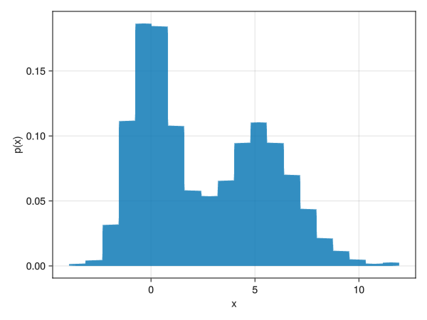
-
外枠の色を付ける (複数のヒストグラムを表示するのに使える?)
                using Random
                using Dates
                rng = MersenneTwister(Millisecond(now()).value)

                fig = Figure()
                x1 = randn(rng, 1000)
                x2 = 2.0 * randn(rng, 1000) .+ 5
                x3 = [x1; x2]

                ax = Axis(fig[1,1], xlabel = "x", ylabel = "p(x)")

                # strokewidthとstrokecolorオプションで外枠を指定できる
                # colorと組合せて複数のヒストグラムの同時表示に使えるかもしれない
                h_1 = hist!(x1, bins = 20, normalization = :pdf, color = (:red, 0.05), strokewidth = 1, strokecolor = :red)
                h_2 = hist!(x2, bins = 20, normalization = :pdf, color = (:blue, 0.05), strokewidth = 1, strokecolor = :blue)
                h_3 = hist!(x3, bins = 20, normalization = :pdf, color = (:green, 0.05), strokewidth = 1, strokecolor = :green)

                axislegend(ax, [h1; h2; h3], ["p₁(x)"; "p₂(x)"; "p₁₊₂(x)"])
                display(fig)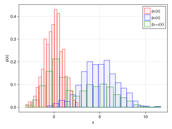
-
ヒストグラムに関する注意点
折れ線グラフのヒストグラムなど、より高度なものをプロットしたい場合はヒストグラムのベクトルを得なければならない。StatsBaseのfit関数によって得ることができるが、結構面倒くさい (このあたりはPython (numpy) の圧倒的勝ち)。
-
無理矢理imshowっぽいヒートマップ
(PythonPlotのimshowほど手軽ではない)fig = Figure() # yreversed = trueでy軸の上下を入れ替えておく ax = Axis(fig[1,1], yreversed = true) matrix = [2 3 0 0; 1 2 3 0; 0 1 2 3;] # 転置行列を取る # interpolate = falseで補間しないようにする (画像ならいらない) # デフォルトだと白黒なので、見やすいカラーマップを指定する c_matrix = image!(ax, matrix', interpolate = false, colormap = :viridis) # カラーバーも普通に付けられる Colorbar(fig[1,2], c_matrix) display(fig)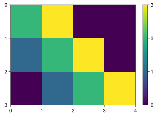
-
heatmapによるヒートマップ
heatmapは等高線のようなイメージで、x座標とy座標を指定できる
座標の指定方法はPythonPlotのpcolorと異なってベクトルで指定する
基本的には行列の行方向がxに、列がy方向になる。fig = Figure() ax = Axis(fig[1,1], xlabel = "x", ylabel = "y") # xとyの値に対するベクトルを作成する x = collect(range(- 2pi, 2pi, length = 100)) y = collect(range(- pi, pi, length = 100)) # heatmap!(ax, x座標を指定するベクトル, y座標を指定するベクトル, ヒートマップに対する行列) # colorrange, colormapオプションも使える (linesのところを参照) c_heatmap = heatmap!(ax, x, y, sin.(x .+ y')) Colorbar(fig[1,2], c_heatmap, label = "sin(x+y)") display(fig)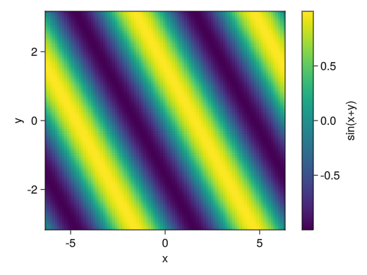
-
3次元グラフではマウスで視点を変えるので別ウインドウで描画する
GLMakie.activate!(inline = false) -
折れ線グラフ
                fig = Figure()

                # Axis3で3次元グラフとなる
                # zlabel, zticks, zlims!などが使える
                # マウスで回転させたときに自動で縮尺が変わってほしくない場合はviewmode = :fitオプション (およびprotrusions = 0オプション) を付ける
                ax = Axis3(fig[1,1], xlabel = "x = sin(t)", ylabel = "y = cos(t)", zlabel = "z = t + sin(2t)")

                t = collect(range(0, 2pi, length = 100))
                x = sin.(t)
                y = cos.(t)
                z = t + sin.(2t)

                # lines!(ax, xベクトル, yベクトル, zベクトル)で折れ線グラフとなる
                lines!(ax, x, y, z)

                display(fig)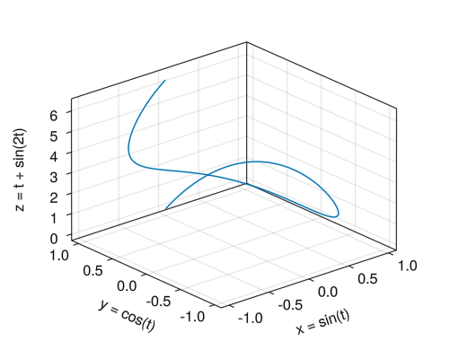
-
散布図
                fig = Figure()

                ax = Axis3(fig[1,1], xlabel = "身長 [cm]", ylabel = "体重 [kg]", zlabel = "血圧上 [mmHg]",
                    title = "マーカーサイズは年齢に対応、スコアは体力測定の結果")
                height = [172.3; 165; 179.6; 174.5; 173.8; 165.4; 164.5; 174.9; 166.8; 185]
                mass = [75.24; 55.8; 78; 71.1; 67.7; 55.4; 63.7; 77.2; 67.5; 84.6]
                blood = [130; 126; 152; 147; 127; 119; 135; 137; 165; 156]
                fat = [21.3; 15.7; 20.1; 18.4; 17.1; 22; 32.2; 36.9; 27.6; 14.4]
                age = [27; 25; 31; 32; 28; 36; 42; 33; 54; 28]
                score = ['C'; 'A'; 'C'; 'B'; 'B'; 'B'; 'D'; 'B'; 'C'; 'B']

                # scatter!(ax, xベクトル, yベクトル, zベクトル)で散布図となる
                c_marker = scatter!(ax, height, mass, blood, markersize = age, color = fat, marker = score)

                Colorbar(fig[1,2], c_marker, label = "体脂肪率 [%]")

                display(fig)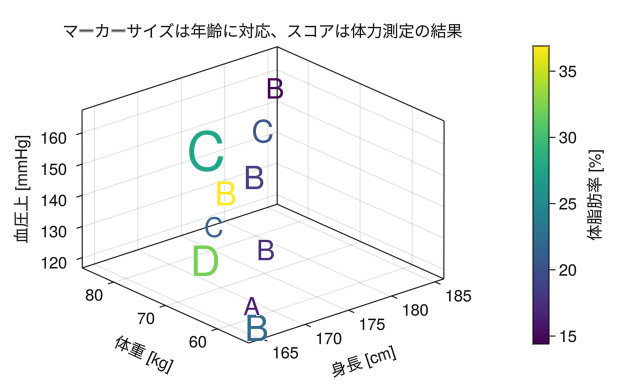
-
ワイヤーフレーム (heatmapに変わる表示)
                fig = Figure()
                ax = Axis3(fig[1,1], xlabel = "x", ylabel = "y", zlabel = "sin(x+y)")

                x = collect(range(- 2pi, 2pi, length = 20))
                y = collect(range(- pi, pi, length = 20))

                # wireframe!(ax, x座標を指定するベクトル, y座標を指定するベクトル, ワイヤーフレームに対する行列)
                wireframe!(ax, x, y, sin.(x .+ y'))

                display(fig)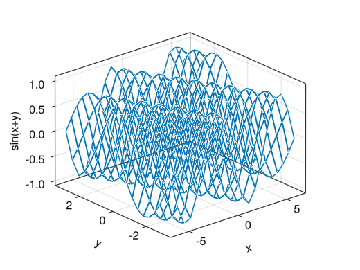
-
色付き曲面
                fig = Figure()
                ax = Axis3(fig[1,1], xlabel = "x", ylabel = "y", zlabel = "sin(x+y)")

                x = collect(range(- 2pi, 2pi, length = 100))
                y = collect(range(- pi, pi, length = 100))

                surface!(ax, x, y, sin.(x .+ y'))

                display(fig)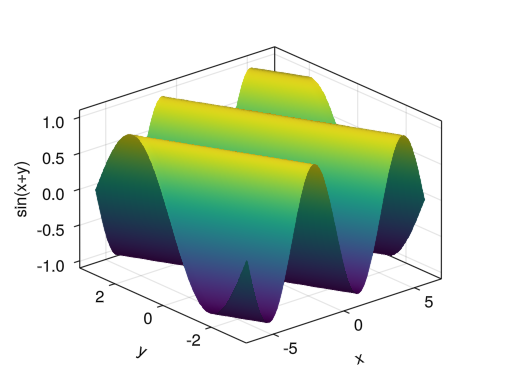
-
色付き曲面 (zの値と色の対応が異なる)
                fig = Figure()
                ax = Axis3(fig[1,1], xlabel = "x", ylabel = "y", zlabel = "tanh(r)")

                x = collect(range(- 5, 5, length = 100))
                y = collect(range(- 5, 5, length = 100))
                r = sqrt.(x .^2 .+ y' .^ 2)
                θ = atan.(0 * x .+ y', x .+ 0 * y')

                # color = 行列で行列に対する色となる
                c_surface = surface!(ax, x, y, tanh(r), color = θ, colorrange = [-pi; pi])

                Colorbar(fig[1,2], c_surface, label = "θ", ticks = ([-pi; 0; pi], ["-π"; "0"; "π"]))

                display(fig)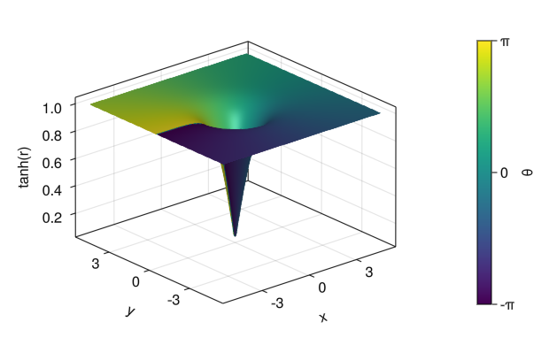
-
対話型グラフではスライダーでパラメーターを変えるので別ウインドウで描画する
GLMakie.activate!(inline = false) -
スライダーを用いてリアルタイムにパラメーターを変更する
fig = Figure() ax = Axis(fig[1,1], xlabel = "時間 [秒]", ylabel = "高さ") xlims!(ax, 0, 1) ylims!(ax, 0, 1.4) t = collect(range(0, 1, length = 100)) # スライダーを作成する # SliderGridでスライダーの基本情報 slider_base = SliderGrid( fig[2,1], # スライダーの場所 # 作りたいスライダーの数だけ()で入力、最後にカンマ # labelで名前、rangeで範囲、startvalueで初期値 (label = "初速 [m/s]", range = 0:0.1:5, startvalue = 5), (label = "摩擦の強さ [/秒]", range = 0.1:0.1:2, startvalue = 0.1), ) # スライダーの基本情報からデータを読み込む # 基本的にここはコピペで良い slider_value = [s.value for s in slider_base.sliders] # スライダーデータからベクトルの作成 S0 = lift(slider_value...) do slider_params... v0 = slider_params[1] - 4.9 * t .^ 2 + v0 * t end Se = lift(slider_value...) do slider_params... v0 = slider_params[1] e = slider_params[2] (9.8 + e * v0) * (1 .- exp.(- e * t)) / e^2 - 9.8 * t / e end S0_line = lines!(ax, t, S0) Se_line = lines!(ax, t, Se) axislegend(ax, [S0_line, Se_line], ["摩擦なし", "摩擦あり"]) display(fig) -
@listを用いたObservableの扱い
上の例のベクトルS0やSeはスライダーのデータをリアルタイムに反映するObservableという型の変数である
Observable変数に関数を作用させたり、titleやxlim等で読み込んだりするには関数@liftが必要であるfig = Figure() ax = Axis(fig[1,1], xlabel = "時間 [秒]", ylabel = "高さ") t = collect(range(0, 2, length = 100)) slider_base = SliderGrid( fig[2,1], (label = "初速 [m/s]", range = 1:0.1:10, startvalue = 2), (label = "摩擦の強さ [/秒]", range = 0.1:0.1:2, startvalue = 2), ) slider_value = [s.value for s in slider_base.sliders] S0 = lift(slider_value...) do slider_params... v0 = slider_params[1] - 4.9 * t .^ 2 + v0 * t end Se = lift(slider_value...) do slider_params... v0 = slider_params[1] e = slider_params[2] (9.8 + e * v0) * (1 .- exp.(- e * t)) / e^2 - 9.8 * t / e end # 次の値tmaxもObservable変数である tmax = lift(slider_value...) do slider_params... v0 = slider_params[1] v0 / 4.9 end S0_line = lines!(ax, t, S0) Se_line = lines!(ax, t, Se) axislegend(ax, [S0_line, Se_line], ["摩擦なし", "摩擦あり"]) # Observable変数の前に$を付ける @lift(xlims!(ax, 0, $tmax)) @lift(ylims!(ax, 0, maximum($S0))) display(fig)
-
アニメーションは別ウインドウで描画する
GLMakie.activate!(inline = false) -
アニメーションはいわゆるパラパラマンガの要領で作成する
ただしPythonPlotと異なって、グラフを作り直すのではなく
Observable変数の関数をプロットし、その変数を更新するという形でアニメーションを作るfig = Figure() q = pi / 4 v0 = 5.0 v0x = v0 * cos(q) v0y = v0 * sin(q) g = 9.8 t = 0.0 x = 0.0 y = 0.0 # t, x, yに対してObservable変数を作成する (ただしtは文字列として) t_obs = Observable(string(t)) x_obs = Observable(x) y_obs = Observable(y) # Observable変数を含む演算には@liftが必要 # (対話型グラフを参照) ax = Axis(fig[1,1], xlabel = "水平距離 [m]", ylabel = "垂直距離 [m]", title = @lift("t = " * $t_obs * " [秒]")) # グラフのプロット scatter!(ax, x_obs, y_obs) xlims!(ax, 0, 3) ylims!(ax, 0, 0.8) display(fig) # アニメーションを表示するためのfor文 for it = 1:200 t = it * 0.0035 x = v0x * t y = v0y * t - 0.5 * g * t ^ 2 # Observable変数を更新する前に規定時間 (秒) だけ計算をストップ sleep(0.05) # Observable変数の更新 t_obs[] = string(t) x_obs[] = x y_obs[] = y end -
ちょっとしたTips
using Printf fig = Figure() q = pi / 4 v0 = 5.0 v0x = v0 * cos(q) v0y = v0 * sin(q) g = 9.8 t = 0.0 x = 0.0 y = 0.0 # 点の軌跡をプロットするためのベクトル # 始めは全ての要素をNaN (未定義値) にしておく xt = zeros(200) * NaN yt = zeros(200) * NaN # @sprintfを使うと有効数字を指定できる。5.3fとは5マス使って小数点以下3桁表示という意味 # (ライブラリPrintfが必要) t_obs = Observable(@sprintf("%5.3f", t)) x_obs = Observable(x) y_obs = Observable(y) xt_obs = Observable(xt) yt_obs = Observable(yt) ax = Axis(fig[1,1], xlabel = "水平距離 [m]", ylabel = "垂直距離 [m]", title = @lift("t = " * $t_obs * " [秒]")) scatter!(ax, x_obs, y_obs) lines!(ax, xt_obs, yt_obs) xlims!(ax, 0, 3) ylims!(ax, 0, 0.8) display(fig) for it = 1:200 t = it * 0.0035 x = v0x * t y = v0y * t - 0.5 * g * t ^ 2 xt[it] = x yt[it] = y sleep(0.05) t_obs[] = @sprintf("%5.3f", t) x_obs[] = x y_obs[] = y xt_obs[] = xt yt_obs[] = yt end -
アニメーションの保存
                fig = Figure()

                q = pi / 4
                v0 = 5.0
                v0x = v0 * cos(q)
                v0y = v0 * sin(q)
                g = 9.8

                t = 0.0
                x = 0.0
                y = 0.0

                xt = zeros(200) * NaN
                yt = zeros(200) * NaN

                t_obs = Observable(@sprintf("%5.3f", t))
                t_obs = Observable(t)
                x_obs = Observable(x)
                y_obs = Observable(y)
                xt_obs = Observable(xt)
                yt_obs = Observable(yt)

                ax = Axis(fig[1,1], xlabel = "水平距離 [m]", ylabel = "垂直距離 [m]",
                    title = @lift("t = " * $t_obs * " [秒]"))

                scatter!(ax, x_obs, y_obs)
                lines!(ax, xt_obs, yt_obs)
                xlims!(ax, 0, 3)
                ylims!(ax, 0, 0.8)

                # forの代わりにrecordを使ってアニメーションを保存する
                record(fig, "animation.mp4", 1:200, framerate = 20) do it

                    # display(fig)をここにしておくとアニメーションをチェックできる
                    display(fig)

                    t = it * 0.0035
                    x = v0x * t
                    y = v0y * t - 0.5 * g * t ^ 2
                    xt[it] = x
                    yt[it] = y

                    sleep(0.05)

                    t_obs[] = @sprintf("%5.3f", t)
                    x_obs[] = x
                    y_obs[] = y
                    xt_obs[] = xt
                    yt_obs[] = yt
                end