-
まずはインポート
using PythonPlot rc("font", family = "MS Gothic") # 軸の名前などに日本語が使用可能 -
グラフの基本
                # 描画領域の確保
                fig = figure()

                # 軸の確保
                # 1つだけのグラフであれば1,1,1で問題ない
                # 複数のグラフを並べるときにこの数字は変わるが、それについては後述
                ax = fig.add_subplot(1,1,1)

                # 軸に折れ線グラフを描く
                # 折れ線グラフはplotで、散布図 (線なし) はscatter
                # ただしplotで散布図を描くこともできる
                ax.plot([1;4;7], [2;5;1]) # (1,2),(4,5),(7,1)を繋ぐ折れ線グラフ

                # グラフの描画
                plotshow()
                # VS Code上で描画するには次の1行も必要 (Jupyter notebookであれば必要なし)
                PythonPlot.display_figs()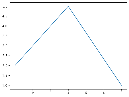
-
点を打つ
                fig = figure()
                ax = fig.add_subplot(1,1,1)

                # markerオプションで指定した座標に点を打つことができる
                # marker = "o" : 丸い点
                # marker = "x" : バツ印
                # marker = "^" : 三角形
                ax.plot([1;4;7], [2;5;1], marker = "o")

                plotshow()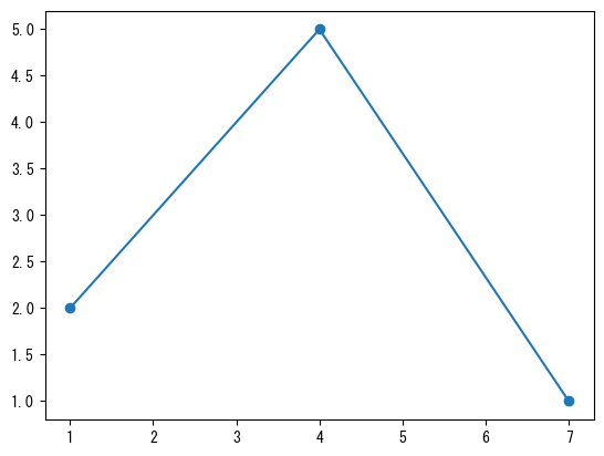
-
線種の変更
                fig = figure()
                ax = fig.add_subplot(1,1,1)
                x = collect(range(0, 2pi, length = 100))

                # linestyleオプションで線種の変更ができる
                # linestyle = "dashed" : 破線
                # linestyle = "dotted" : 点線
                # linestyle = "dashdot" : 一点鎖線
                # linestyle = "none" : 線なし (markerと組み合わせると散布図ができる)
                ax.plot(x, sin.(x), linestyle = "dashed")

                plotshow()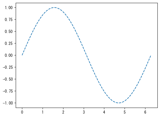
-
色を変える
                fig = figure()
                ax = fig.add_subplot(1,1,1)
                x = collect(range(0, 2pi, length = 100))

                # colorオプションで色の変更ができる (点の色も同時に変わる)
                # color = "red"
                # color = "tab:red" : 柔らかめの赤
                # color = "black"
                ax.plot(x, sin.(x), color = "tab:green")

                plotshow()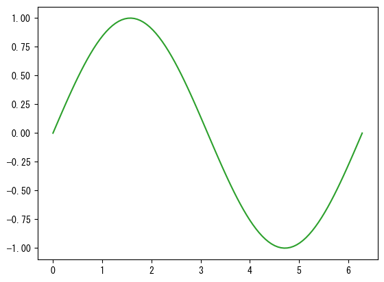
-
軸に名前を付ける
                fig = figure()
                ax = fig.add_subplot(1,1,1)
                x = collect(range(0, 2pi, length = 100))

                # ax.set_xlabelでx軸に名前が付く
                ax.set_xlabel("x軸の名前")
                # ax.set_ylabelでy軸に名前が付く
                ax.set_ylabel("y軸の名前")

                ax.plot(x, sin.(x))

                plotshow()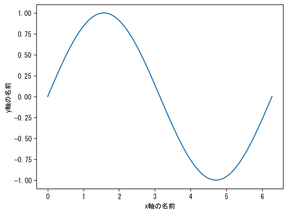
-
グラフに名前を付ける
                fig = figure()
                ax = fig.add_subplot(1,1,1)
                x = collect(range(0, 2pi, length = 100))

                # ax.set_titleでグラフに名前が付く
                ax.set_title("sin(x)のグラフ")

                ax.plot(x, sin.(x))

                plotshow()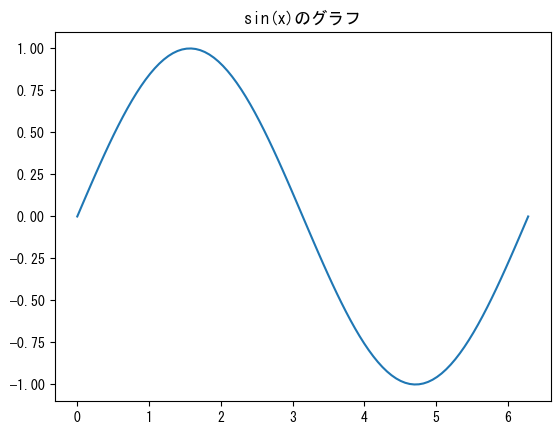
-
軸の範囲を設定する
                fig = figure()
                ax = fig.add_subplot(1,1,1)
                x = collect(range(0, 2pi, length = 100))

                # ax.set_xlimでx軸の範囲を変えられる
                ax.set_xlim(0, pi)
                # ax.set_ylimでy軸の範囲を変えられる
                ax.set_ylim(-5, 5)

                ax.plot(x, tan.(x))

                plotshow()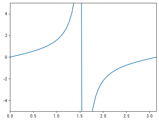
-
軸の数値を設定する
                fig = figure()
                ax = fig.add_subplot(1,1,1)
                x = collect(range(0, 2pi, length = 100))

                # ax.set_xticks (ベクトル) でx軸の数値を好きな部分だけ表示できる
                ax.set_xticks([0; pi/2; pi; 3pi/2; 2pi])
                # ax.set_yticks (ベクトル) でy軸の数値を好きな部分だけ表示できる
                ax.set_yticks([-1; -0.5; 0; 0.5; 1])

                ax.plot(x, sin.(x))

                plotshow()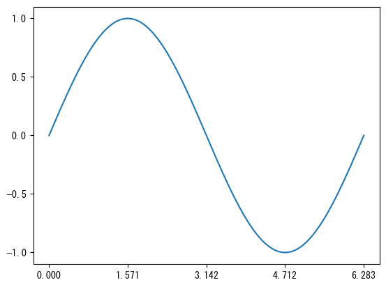
-
軸の数値を設定し、好きな表記にする
                fig = figure()
                ax = fig.add_subplot(1,1,1)
                x = collect(range(0, 2pi, length = 100))

                ax.set_xticks([0; pi/2; pi; 3pi/2; 2pi])
                # ax.set_xticklabels (ベクトル) で、xticksで設定した数値の表示を変えることができる
                # ax.set_xticksとax.set_xtickslabelsのベクトルの要素数は同じでなければならない
                ax.set_xticklabels(["0"; "π/2"; "π"; "3π/2"; "2π"])

                ax.set_yticks([-1; 0; 1])
                # ax.set_yticklabels (ベクトル) で、yticksで設定した数値の表示を変えることができる
                # ax.set_yticksとax.set_ytickslabelsのベクトルの要素数は同じでなければならない
                ax.set_yticklabels(["ymin"; "0"; "ymax"])

                ax.plot(x, sin.(x))

                plotshow()
-
目盛りに対してグリッドを付ける
                fig = figure()
                ax = fig.add_subplot(1,1,1)
                x = collect(range(0, 2pi, length = 100))

                ax.set_xticks([0; pi/2; pi; 3pi/2; 2pi])
                ax.set_xticklabels(["0"; "π/2"; "π"; "3π/2"; "2π"])
                # ax.set_grid (axis = "x") で、x軸の目盛りに対してグリッドが付く。
                ax.grid(axis = "x")

                ax.set_yticks([-1; 0; 1])
                ax.set_yticklabels(["ymin"; "0"; "ymax"])
                # ax.set_grid (axis = "y") で、y軸の目盛りに対してグリッドが付く。
                ax.grid(axis = "y", color="tab:red", linestyle = "dashed")

                ax.plot(x, sin.(x))

                plotshow()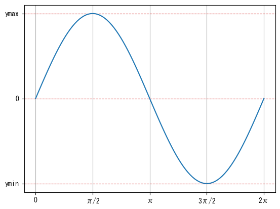
-
数値の付かない小目盛りを付ける
                fig = figure()
                ax = fig.add_subplot(1,1,1)
                x = collect(range(0, 2pi, length = 100))

                ax.set_xticks([0; pi/2; pi; 3pi/2; 2pi])
                ax.set_xticklabels(["0"; "π/2"; "π"; "3π/2"; "2π"])
                # minor = trueオプションで小目盛りの設定になる
                ax.set_xticks([pi/4; 3pi/4; 5pi/4; 7pi/4], minor = true)

                ax.set_yticks([-1; 0; 1])
                ax.set_yticklabels(["ymin"; "0"; "ymax"])

                ax.plot(x, sin.(x))

                plotshow()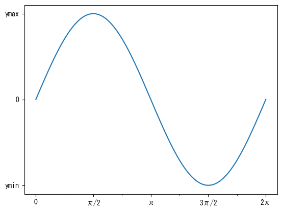
-
小目盛りに対するグリッドを付ける
                fig = figure()
                ax = fig.add_subplot(1,1,1)
                x = collect(range(0, 2pi, length = 100))

                ax.set_xticks([0; pi/2; pi; 3pi/2; 2pi])
                ax.set_xticklabels(["0"; "π/2"; "π"; "3π/2"; "2π"])
                ax.set_xticks([pi/4; 3pi/4; 5pi/4; 7pi/4], minor = true)
                ax.grid(axis = "x")
                # which = "minor"オプションで小目盛りに対するグリッドになる
                ax.grid(axis = "x", which = "minor", linestyle = "dashed")

                ax.set_yticks([-1; 0; 1])
                ax.set_yticklabels(["ymin"; "0"; "ymax"])

                ax.plot(x, sin.(x))

                plotshow()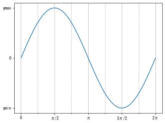
-
x軸とy軸の長さと数値の割合を同じにする
                fig = figure()
                ax = fig.add_subplot(1,1,1)
                x = collect(range(0, 2pi, length = 100))

                # ax.set_aspect(1)で、縦と横の数値の比率が同じになる
                ax.set_aspect(1)

                ax.plot(x, sin.(x))

                plotshow()
-
文字列にLaTeXを用いる
                fig = figure()
                ax = fig.add_subplot(1,1,1)
                x = collect(range(0, 2pi, length = 100))

                # 文字列の""の前にLを付けることによりLaTeXの表記が使えるようになる
                # ax.set_x(y)label, ax.set_title, ax.set_x(y)ticklabels, label (後述) 等が対応する
                ax.set_xlabel(L"$x$")
                ax.set_ylabel(L"$\sin(x)$")
                ax.set_title(L"$\sin(x)$のグラフ")

                ax.set_xticks([0; pi/2; pi; 3pi/2; 2pi])
                ax.set_xticklabels(["0"; L"$\pi/2$"; L"$\pi$"; L"$3\pi/2$"; L"$2\pi$"])

                ax.set_yticks([-1; 0; 1])
                ax.set_yticklabels([L"$y_\mathrm{min}$"; "0"; L"$y_\mathrm{max}$"])

                ax.plot(x, sin.(x))

                plotshow()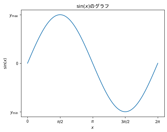
-
グラフのサイズ
                # figsizeオプションで描画領域のサイズを変えることができる
                # デフォルトは[6.4; 4.8]
                fig = figure(figsize = [6.4; 4.8] * 0.75)
                ax = fig.add_subplot(1,1,1)
                x = collect(range(0, 2pi, length = 100))
                ax.plot(x, sin.(x))

                plotshow()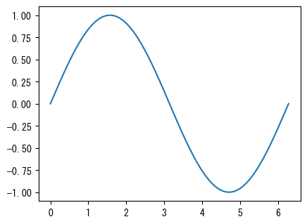
-
グラフの保存
                fig = figure()
                ax = fig.add_subplot(1,1,1)
                x = collect(range(0, 2pi, length = 100))
                ax.plot(x, sin.(x))

                # plotshow()の代わりにsavefig("ファイル名")とすればグラフの保存ができる
                # オプションでbbox_inches = "tight", pad_inches = 0.1とすれば周囲の余計な余白を極力小さくできる
                # よく使う拡張子としてpngとpdfがある (拡張子で保存するファイルタイプを自動的に判断してくれる)
                savefig("graph.png", bbox_inches = "tight", pad_inches = 0.1)
-
1つの軸に複数のグラフを描画する
                fig = figure()
                ax = fig.add_subplot(1,1,1)
                x = collect(range(0, 2pi, length = 100))

                # ax.plotやax.scatterを繰り返し使うことで1つの軸に複数のグラフを描画できる
                # 色は自動で変わる (勿論colorオプションで1つずつ指定できる)
                ax.plot(x, sin.(x))
                ax.plot(x, cos.(x))

                plotshow()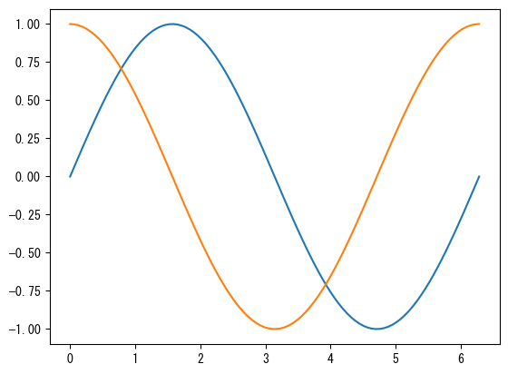
-
plotとscatterの混在
                fig = figure()
                ax = fig.add_subplot(1,1,1)
                x1 = collect(range(0, 2pi, length = 100))
                x2 = collect(range(0, 2pi, length = 10))

                # ax.plotとax.scatterを混在させることもできる
                # 色の管理はplotとscatterで別なので注意
                ax.plot(x1, sin.(x1))
                ax.scatter(x2, cos.(x2))

                plotshow()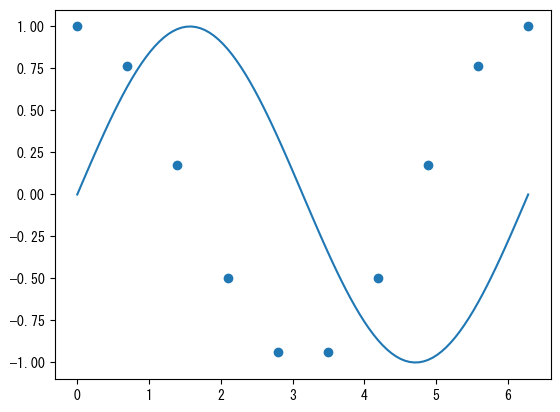
-
凡例の表示
                fig = figure()
                ax = fig.add_subplot(1,1,1)
                x = collect(range(0, 2pi, length = 100))

                # labelオプションで名前を付ける
                ax.plot(x, sin.(x), label = L"$\sin(x)$")
                ax.plot(x, cos.(x), label = L"$\cos(x)$")

                # ax.legend()で、labelオプションで付けた名前を凡例として表示できる
                ax.legend()

                plotshow()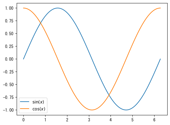
-
凡例の位置
                fig = figure()
                ax = fig.add_subplot(1,1,1)
                x = collect(range(0, 2pi, length = 100))

                ax.plot(x, sin.(x), label = L"$\sin(x)$")
                ax.plot(x, sin.(x .- 2pi / 5), label = L"$\sin(x-2\pi/5)$")
                ax.plot(x, sin.(x .- 4pi / 5), label = L"$\sin(x-4\pi/5)$")
                ax.plot(x, sin.(x .- 6pi / 5), label = L"$\sin(x-6\pi/5)$")
                ax.plot(x, sin.(x .- 8pi / 5), label = L"$\sin(x-8\pi/5)$")

                # 凡例の位置は自動で調節してくれるが、locで大まかな位置を指定できる
                #  左上 "upper left"
                # 中央上 "upper center"
                #  右上 "upper right"
                # 左中央 "center left"
                #  中央 "center"
                # 右中央 "center right"
                #  左下 "lower left"
                # 中央下 "lower center"
                #  右下 "lower right"
                ax.legend(loc = "center")

                plotshow()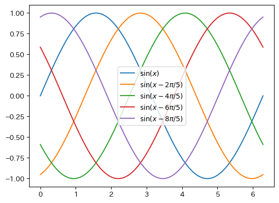
-
凡例の詳細位置
                fig = figure()
                ax = fig.add_subplot(1,1,1)
                x = collect(range(0, 2pi, length = 100))

                ax.plot(x, sin.(x), label = L"$\sin(x)$")
                ax.plot(x, sin.(x .- 2pi / 5), label = L"$\sin(x-2\pi/5)$")
                ax.plot(x, sin.(x .- 4pi / 5), label = L"$\sin(x-4\pi/5)$")
                ax.plot(x, sin.(x .- 6pi / 5), label = L"$\sin(x-6\pi/5)$")
                ax.plot(x, sin.(x .- 8pi / 5), label = L"$\sin(x-8\pi/5)$")

                # bbox_to_anchorで位置を指定できる。(0,0)が左下、(1,1)が右上
                # さらにlocを指定すると凡例の位置をbbox_to_anchorに設定できる
                # ncolsで列数を指定できる

                ax.legend(bbox_to_anchor = (0.5, 1), loc = "lower center", ncols = 5)

                plotshow()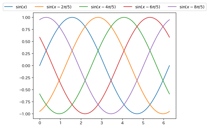
-
左右に異なるy軸
                fig = figure()
                t = collect(range(0, 0.9, length = 100))

                # まずは左側 (通常) のy軸に対するグラフを作成する
                ax1 = fig.add_subplot(1,1,1)

                ax1.plot(t, 5 .- 9.8 * t)
                ax1.set_xlabel("時刻 [s]")
                ax1.set_ylabel("速度 [m/s]")

                # 右側のy軸に対するグラフを作成する
                # twinxを用いて右側にy軸が来る軸の作成
                ax2 = ax1.twinx()

                # ax1とax2で色の管理が別なので注意
                ax2.plot(t, - 4.9 * t .^ 2 + 5 * t)
                ax2.set_ylabel("高さ [m]")

                plotshow()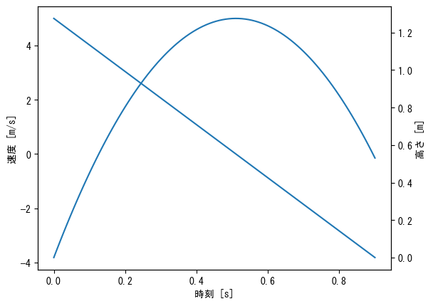
-
左右に異なるy軸 (色、凡例の調整)
                fig = figure()
                t = collect(range(0, 0.9, length = 100))

                ax1 = fig.add_subplot(1,1,1)

                ax1.plot(t, 5 .- 9.8 * t, label = "速度 (摩擦なし) ")
                ax1.plot(t, 24.6 * exp.(- t / 2) .- 19.6, label = "速度 (摩擦あり) ")
                ax1.set_xlabel("時刻 [s]")
                ax1.set_ylabel("速度 [m/s]")
                ax1.legend()

                ax2 = ax1.twinx()

                ax2.plot(t, - 4.9 * t .^ 2 + 5 * t, label = "高さ (摩擦なし) ", color = "tab:green")
                ax2.plot(t, 49.2 * (1 .- exp.(- t / 2)) - 19.6 * t, label = "高さ (摩擦あり) ", color = "tab:red")
                ax2.set_ylabel("高さ [m]")
                ax2.legend()

                plotshow()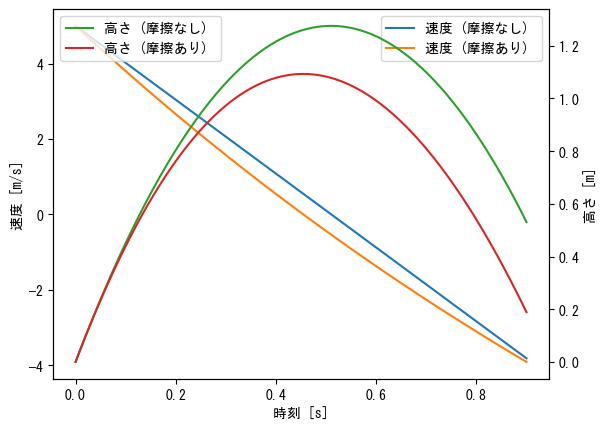
-
複数の軸
                # 複数の軸を描画するので描画領域の大きさを必ず設定しておく
                fig = figure(figsize = [6.4 * 2; 4.8 * 3] * 0.8)
                x1 = collect(range(- pi, pi, length = 100))
                x2 = collect(range(-1, 1, length = 100))
                x3 = collect(range(-2, 2, length = 100))
                x4 = collect(range(1, 2, length = 100))

                # 縦3行横2列に軸を並べたときの1つめ、という意味
                ax = fig.add_subplot(3,2,1)
                ax.plot(x1, sin.(x1), label = L"$\sin(x)$")
                ax.plot(x1, cos.(x1), label = L"$\cos(x)$")
                ax.plot(x1, tan.(x1), label = L"$\tan(x)$")
                ax.set_ylim(-1.5, 1.5)
                ax.set_xlabel(L"$x$")
                ax.set_title("三角関数のグラフ")
                ax.legend()

                # 縦3行横2列に軸を並べたときの2つめ、という意味
                ax = fig.add_subplot(3,2,2)
                ax.plot(x3, sinh.(x3), label = L"$\sinh(x)$")
                ax.plot(x3, cosh.(x3), label = L"$\cosh(x)$")
                ax.plot(x3, tanh.(x3), label = L"$\tanh(x)$")
                ax.set_xlabel(L"$x$")
                ax.set_title("双曲線関数のグラフ")
                ax.legend()

                # 縦3行横2列に軸を並べたときの3つめ、という意味
                ax = fig.add_subplot(3,2,3)
                ax.plot(x1, 1 ./ sin.(x1), label = L"$\csc(x)$")
                ax.plot(x1, 1 ./ cos.(x1), label = L"$\sec(x)$")
                ax.plot(x1, 1 ./ tan.(x1), label = L"$\cot(x)$")
                ax.set_ylim(-10, 10)
                ax.set_xlabel(L"$x$")
                ax.set_title("三角関数の逆数のグラフ")
                ax.legend()

                # 縦3行横2列に軸を並べたときの4つめ、という意味
                ax = fig.add_subplot(3,2,4)
                ax.plot(x3, 1 ./ sinh.(x3), label = L"$\mathrm{csch}(x)$")
                ax.plot(x3, 1 ./ cosh.(x3), label = L"$\mathrm{sech}(x)$")
                ax.plot(x3, 1 ./ tanh.(x3), label = L"$\coth(x)$")
                ax.set_ylim(-4, 4)
                ax.set_xlabel(L"$x$")
                ax.set_title("双曲線関数の逆数のグラフ")
                ax.legend()

                # 縦3行横2列に軸を並べたときの5つめ、という意味
                ax = fig.add_subplot(3,2,5)
                ax.plot(x2, asin.(x2), label = L"$\sin^{-1}(x)$")
                ax.plot(x2, acos.(x2), label = L"$\cos^{-1}(x)$")
                ax.plot(x3, atan.(x3), label = L"$\tan^{-1}(x)$")
                ax.set_xlabel(L"$x$")
                ax.set_title("逆三角関数のグラフ")
                ax.legend()

                # 縦3行横2列に軸を並べたときの6つめ、という意味
                ax = fig.add_subplot(3,2,6)
                ax.plot(x3, asinh.(x3), label = L"$\sinh^{-1}(x)$")
                ax.plot(x4, acosh.(x4), label = L"$\cosh^{-1}(x)$")
                ax.plot(x2, atanh.(x2), label = L"$\tanh^{-1}(x)$")
                ax.set_xlabel(L"$x$")
                ax.set_title("逆双曲線関数のグラフ")
                ax.legend()

                # subplots_adjustで軸の間隔を調整
                # wspaceが横方向、hspaceが縦方向
                subplots_adjust(wspace=0.2, hspace=0.3)

                plotshow()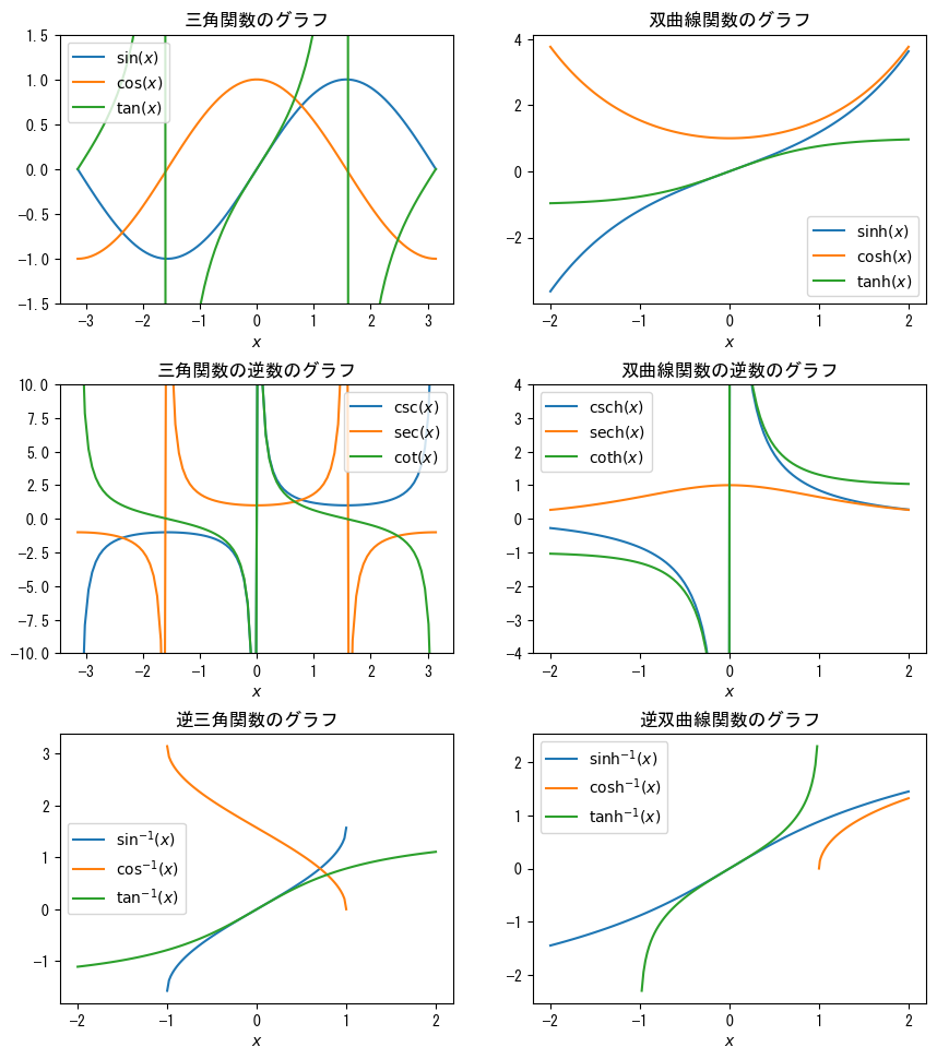
-
片対数グラフ
                fig = figure()
                x = collect(range(0, 5, length = 5))

                ax = fig.add_subplot(1,1,1)

                # ax.set_yscale("log")で片対数グラフ (y軸が対数スケール) となる
                ax.set_yscale("log")

                ax.plot(x, 5 * exp.(- 2 * x), marker = "o")
                ax.set_title("片対数グラフでは指数関数が直線となる")

                ax.set_xlabel(L"$x$")
                ax.set_ylabel(L"$5e^{-2x}$")

                plotshow()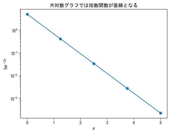
-
両対数グラフ
                fig = figure()
                x = collect(range(1, 100, length = 10))

                ax = fig.add_subplot(1,1,1)

                # ax.set_xscale("log")を追加して両対数グラフ (x軸、y軸が対数スケール) となる
                ax.set_xscale("log")
                ax.set_yscale("log")

                ax.plot(x, 10 * x .^ (- 5 / 3), marker = "o")
                ax.set_title("両対数グラフではべき関数が直線となる")

                ax.set_xlabel(L"$x$")
                ax.set_ylabel(L"$10x^{-5/3}$")

                plotshow()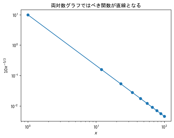
-
対数グラフでticks (軸の数値の設定) を使うときはticklabelsと併用すると良い (というか併用しないと上手く表示されないことがある)
                # 対数スケールのグラフでは基本的に小目盛りが表示されたままとなる
                # 無理やり消したい場合は次の記述を加えると良い
                rc("ytick.minor", size = 0) # x軸が対数スケールの場合にはxtick.minorとする

                fig = figure()
                x = collect(range(0, 5, length = 5))

                ax = fig.add_subplot(1,1,1)

                ax.set_yscale("log")

                # y軸に設定したい数値のベクトルを設定しておく
                vector_y = [0.02; 0.7; 1.4; 5]
                ax.set_yticks(vector_y)
                ax.set_yticklabels(string.(vector_y))

                ax.plot(x, 5 * exp.(- 2 * x), marker = "o")

                ax.set_xlabel(L"$x$")
                ax.set_ylabel(L"$5e^{-2x}$")

                plotshow()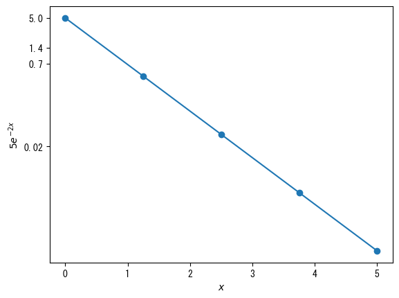
-
基本的なヒストグラム
                using Random
                using Dates
                rng = MersenneTwister(Millisecond(now()).value)

                fig = figure()
                x = [randn(rng, 1000); 2.0 * randn(rng, 1000) .+ 5]

                ax = fig.add_subplot(1,1,1)

                # ax.hist(ベクトル)でヒストグラムとなる
                ax.hist(x)

                ax.set_xlabel(L"$x$")
                ax.set_ylabel("頻度")

                plotshow()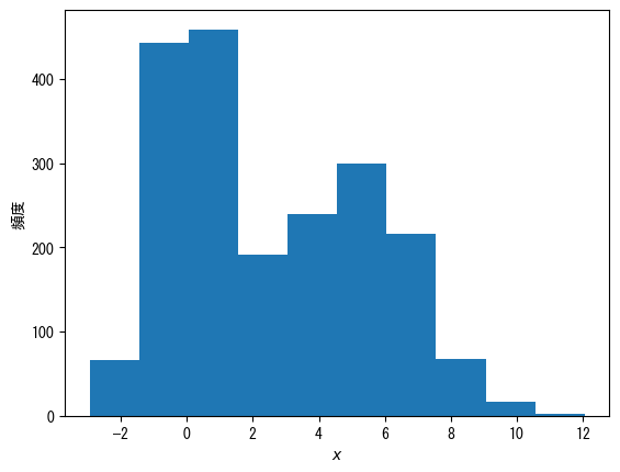
-
階級数を変える
                using Random
                using Dates
                rng = MersenneTwister(Millisecond(now()).value)

                fig = figure()
                x = [randn(rng, 1000); 2.0 * randn(rng, 1000) .+ 5]

                ax = fig.add_subplot(1,1,1)

                # binsオプションで階級数を指定できる
                ax.hist(x, bins = 20)

                ax.set_xlabel(L"$x$")
                ax.set_ylabel("頻度")

                plotshow()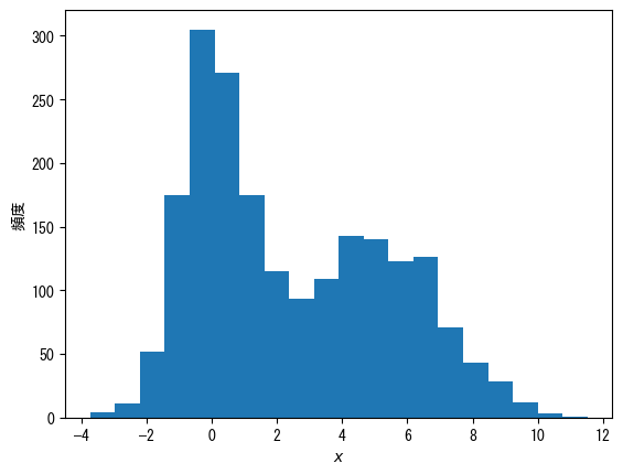
-
頻度ではなく確率分布にする
                using Random
                using Dates
                rng = MersenneTwister(Millisecond(now()).value)

                fig = figure()
                x = [randn(rng, 1000); 2.0 * randn(rng, 1000) .+ 5]

                ax = fig.add_subplot(1,1,1)

                # density = trueで頻度ではなく確率分布となる
                ax.hist(x, bins = 20, density = true)

                ax.set_xlabel(L"$x$")
                ax.set_ylabel(L"$p(x)$")

                plotshow()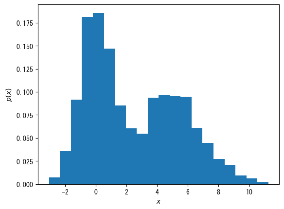
-
棒を外枠のみにする (複数のヒストグラムを表示するのに便利)
                using Random
                using Dates
                rng = MersenneTwister(Millisecond(now()).value)

                fig = figure()
                x1 = randn(rng, 1000)
                x2 = 2.0 * randn(rng, 1000) .+ 5
                x3 = [x1; x2]

                ax = fig.add_subplot(1,1,1)

                # histtype = "step"で外枠のみとなる
                ax.hist(x1, bins = 20, density = true, histtype = "step", label = L"$p_1(x)$")
                ax.hist(x2, bins = 20, density = true, histtype = "step", label = L"$p_2(x)$")
                ax.hist(x3, bins = 20, density = true, histtype = "step", label = L"$p_{1 + 2}(x)$")

                ax.set_xlabel(L"$x$")
                ax.set_ylabel(L"$p(x)$")
                ax.legend()

                plotshow()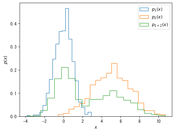
-
ヒストグラムに関する注意点
折れ線グラフのヒストグラムなど、より高度なものをプロットしたい場合はヒストグラムのベクトルを得なければならない。StatsBaseのfit関数によって得ることができるが、結構面倒くさい (このあたりはPython (numpy) の圧倒的勝ち)。
-
scatterによる散布図で点の色に対して、別のベクトルを指定する
                fig = figure()
                height = [172.3; 165; 179.6; 174.5; 173.8; 165.4; 164.5; 174.9; 166.8; 185]
                mass = [75.24; 55.8; 78; 71.1; 67.7; 55.4; 63.7; 77.2; 67.5; 84.6]
                fat = [21.3; 15.7; 20.1; 18.4; 17.1; 22; 32.2; 36.9; 27.6; 14.4]

                ax = fig.add_subplot(1,1,1)

                # cオプションでベクトルを指定することにより、そのベクトルの値に対応した点の色になる
                ax.scatter(height, mass, c = fat)

                ax.set_xlabel("身長 [cm]")
                ax.set_ylabel("体重 [kg]")

                plotshow()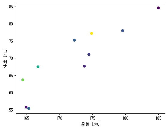
-
色と数値を対応させるカラーバーを表示
                fig = figure()
                height = [172.3; 165; 179.6; 174.5; 173.8; 165.4; 164.5; 174.9; 166.8; 185]
                mass = [75.24; 55.8; 78; 71.1; 67.7; 55.4; 63.7; 77.2; 67.5; 84.6]
                fat = [21.3; 15.7; 20.1; 18.4; 17.1; 22; 32.2; 36.9; 27.6; 14.4]

                ax = fig.add_subplot(1,1,1)

                # 散布図scatter自体を変数として代入 (今の場合はc_pointsという変数)
                c_points = ax.scatter(height, mass, c = fat)

                # colorbar(c_points, ax = ax)でカラーバーが追加される
                colorbar(c_points, ax = ax)

                ax.set_xlabel("身長 [cm]")
                ax.set_ylabel("体重 [kg]")

                plotshow()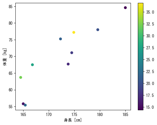
-
色、カラーバーに関するオプション1
                fig = figure()
                height = [172.3; 165; 179.6; 174.5; 173.8; 165.4; 164.5; 174.9; 166.8; 185]
                mass = [75.24; 55.8; 78; 71.1; 67.7; 55.4; 63.7; 77.2; 67.5; 84.6]
                fat = [21.3; 15.7; 20.1; 18.4; 17.1; 22; 32.2; 36.9; 27.6; 14.4]

                ax = fig.add_subplot(1,1,1)

                # vmaxオプションとvminオプションで色に対する最大値と最小値を設定できる
                c_points = ax.scatter(height, mass, c = fat, vmin = 10, vmax = 40)

                # labelオプションでカラーバーに名前が付く
                colorbar(c_points, ax = ax, label = "体脂肪率 [%]")

                ax.set_xlabel("身長 [cm]")
                ax.set_ylabel("体重 [kg]")

                plotshow()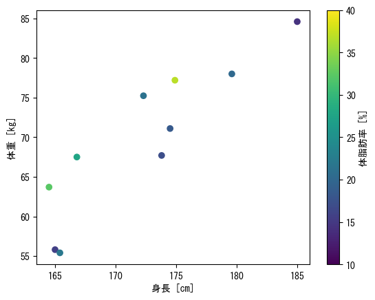
-
色、カラーバーに関するオプション2
                fig = figure()
                height = [172.3; 165; 179.6; 174.5; 173.8; 165.4; 164.5; 174.9; 166.8; 185]
                mass = [75.24; 55.8; 78; 71.1; 67.7; 55.4; 63.7; 77.2; 67.5; 84.6]
                fat = [21.3; 15.7; 20.1; 18.4; 17.1; 22; 32.2; 36.9; 27.6; 14.4]

                ax = fig.add_subplot(1,1,1)

                # cmapオプションで色使いが変えられる
                # viridis : デフォルトの青→黄色
                # jet : 虹色
                # hsv : 周期的な虹色
                c_points = ax.scatter(height, mass, c = fat, cmap = get_cmap(:hsv))

                # ticksオプションで設定した値が表示される
                # さらにカラーバー自体を別の変数に代入し (今の場合はcbar) 、cbar.ax.set_yticklabelsで、表示を変えられる
                cbar = colorbar(c_points, ax = ax, label = "体脂肪率 [%]", ticks = [15; 25; 35])
                cbar.ax.set_yticklabels(["低"; "中"; "高"])

                ax.set_xlabel("身長 [cm]")
                ax.set_ylabel("体重 [kg]")

                plotshow()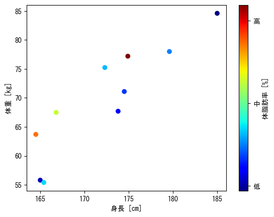
-
点のサイズ
                fig = figure()
                height = [172.3; 165; 179.6; 174.5; 173.8; 165.4; 164.5; 174.9; 166.8; 185]
                mass = [75.24; 55.8; 78; 71.1; 67.7; 55.4; 63.7; 77.2; 67.5; 84.6]
                fat = [21.3; 15.7; 20.1; 18.4; 17.1; 22; 32.2; 36.9; 27.6; 14.4]
                age = [27; 25; 31; 32; 28; 36; 42; 33; 54; 28]

                ax = fig.add_subplot(1,1,1)

                # sオプションで点のサイズを決められる
                # (plotの場合はmarkersize)
                # ただしscatterの場合はcにベクトルを指定することによって点ごとのサイズを変えられる
                c_points = ax.scatter(height, mass, c = fat, s = age * 4)

                cbar = colorbar(c_points, ax = ax, label = "体脂肪率 [%]", ticks = [15; 25; 35])
                cbar.ax.set_yticklabels(["低"; "中"; "高"])

                ax.set_xlabel("身長 [cm]")
                ax.set_ylabel("体重 [kg]")
                ax.set_title("マーカーサイズは年齢に対応")

                plotshow()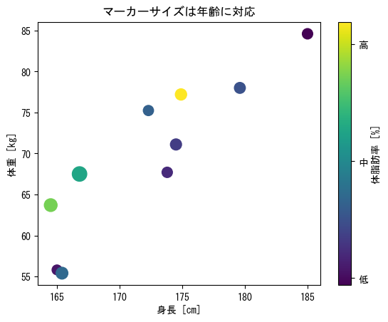
-
imshowは行列を見たまま表示するようなイメージ
                fig = figure()

                matrix = [2 3 0 0;
                     1 2 3 0;
                     0 1 2 3;]

                ax = fig.add_subplot(1,1,1)

                # vmin, vmax, cmapオプションも使える (scatterのところを参照)
                c_matrix = ax.imshow(matrix)

                # カラーバーも使える
                # label, ticksオプションも使える
                colorbar(c_matrix, ax = ax, label = "行列の値")

                ax.set_xlabel("列")
                ax.set_ylabel("行")

                plotshow()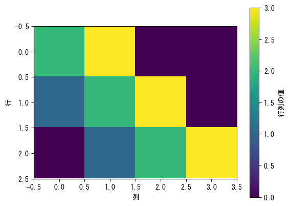
-
カラーバーの高さが気持ち悪い場合
                fig = figure()

                matrix = [2 3 0 0;
                     1 2 3 0;
                     0 1 2 3;]

                ax = fig.add_subplot(1,1,1)

                c_matrix = ax.imshow(matrix)

                # 手っ取り早くはfraction = (行の大きさ) / (列の大きさ) * 0.046, pad = 0.04で揃えられる
                colorbar(c_matrix, ax = ax, label = "行列の値", fraction = 3 / 4 * 0.046, pad = 0.04)

                ax.set_xlabel("列")
                ax.set_ylabel("行")

                plotshow()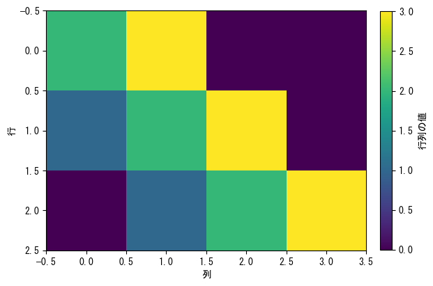
-
pcolorは等高線のようなイメージで、x座標とy座標を指定できる
ただし何も指定しないと、行列の行方向がxに、列がy方向になる (imshowと逆)fig = figure() # xとyの値に対するベクトルを作成する x = collect(range(- 2pi, 2pi, length = 100)) y = collect(range(- pi, pi, length = 100)) # yを行ベクトル (横ベクトル) にする y = transpose(y) # xとyを行列にする x, y = x .+ 0 * y, 0 * x .+ y ax = fig.add_subplot(1,1,1) # 基本はax.pcolor(x座標を指定する行列, y座標を指定する行列, ヒートマップに対する行列, shading = "auto") # vmin, vmax, cmapオプションも使える (scatterのところを参照) c_pcolor = ax.pcolor(x, y, sin.(x .+ y), shading = "auto") # カラーバーも使える # label, ticksオプションも使える colorbar(c_pcolor, ax = ax, label = L"$\sin(x+y)$") ax.set_xlabel(L"$x$") ax.set_ylabel(L"$y$") ax.set_xticks([-2pi; -pi; 0; pi; 2pi]) ax.set_xticklabels([L"$-2\pi$"; L"$-\pi$"; L"$0$"; L"$\pi$"; L"$2\pi$"]) ax.set_yticks([-pi; 0; pi]) ax.set_yticklabels([L"$-\pi$"; L"$0$"; L"$\pi$"]) plotshow()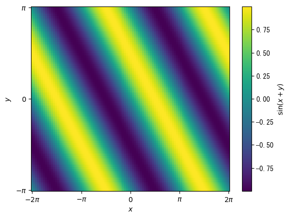
-
3次元グラフの基本
                # 3次元グラフは基本的にマウスを使って視点を自由に変えられると便利である
                # それを可能にするために別ウインドウでグラフを描画する必要がある
                # pygui(true)とすれば別ウインドウでグラフが開く
                # 逆にpygui(false)とすればJupyter notebook上にグラフが表示される
                pygui(true)

                fig = figure()
                t = collect(range(0, 2pi, length = 100))
                x = sin.(t)
                y = cos.(t)
                z = t + sin.(2t)

                # projection = "3d"を追加することで3次元グラフとなる
                ax = fig.add_subplot(1,1,1, projection = "3d")

                # plotは3次元における折れ線グラフで、z座標のベクトルも必要になる
                ax.plot(x, y, z)

                # ax.set_zlabel, ax.set_zticks, ax.set_zticklabels, ax.set_zlimも使える
                ax.set_xlabel(L"$x = \sin(t)$")
                ax.set_ylabel(L"$y = \cos(t)$")
                ax.set_zlabel(L"$z = t + \sin(2t)$")

                plotshow()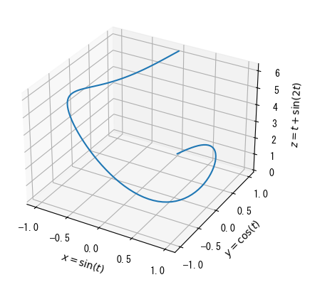
-
散布図
                pygui(true)

                fig = figure()
                age = [27; 25; 31; 32; 28; 36; 42; 33; 54; 28]
                height = [172.3; 165; 179.6; 174.5; 173.8; 165.4; 164.5; 174.9; 166.8; 185]
                mass = [75.24; 55.8; 78; 71.1; 67.7; 55.4; 63.7; 77.2; 67.5; 84.6]
                fat = [21.3; 15.7; 20.1; 18.4; 17.1; 22; 32.2; 36.9; 27.6; 14.4]

                ax = fig.add_subplot(1,1,1, projection = "3d")

                # 3次元scatterは2次元と同様に色に対応するベクトルを指定できる
                c_points = ax.scatter(height, mass, fat, c = age)

                # カラーバーがデフォルトだとグラフに近いため、padオプションで少し離しておくと良い
                colorbar(c_points, ax = ax, label = "年齢 [歳]", pad = 0.15)

                ax.set_xlabel("身長 [cm]")
                ax.set_ylabel("体重 [kg]")
                ax.set_zlabel("体脂肪率 [%]")

                plotshow()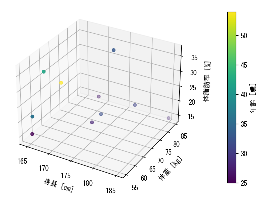
-
曲面 (ワイヤーフレーム) : pcolorに代わる表示方法
                pygui(true)

                fig = figure()

                x = collect(range(- 2pi, 2pi, length = 100))
                y = collect(range(- pi, pi, length = 100))

                y = transpose(y)

                x, y = x .+ 0 * y, 0 * x .+ y

                ax = fig.add_subplot(1,1,1, projection = "3d")

                # ax.plot_wireframeで曲面表示
                ax.plot_wireframe(x, y, sin.(x) + cos.(y))

                ax.set_xlabel(L"$x$")
                ax.set_ylabel(L"$y$")
                ax.set_zlabel(L"$\sin(x)+\cos(y)$")

                ax.set_xticks([-2pi; -pi; 0; pi; 2pi])
                ax.set_xticklabels([L"$-2\pi$"; L"$-\pi$"; L"$0$"; L"$\pi$"; L"$2\pi$"])
                ax.set_yticks([-pi; 0; pi])
                ax.set_yticklabels([L"$-\pi$"; L"$0$"; L"$\pi$"])

                plotshow()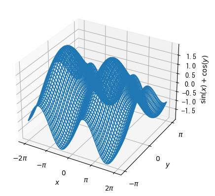
-
色付き曲面
                pygui(true)

                fig = figure()

                x = collect(range(- 2pi, 2pi, length = 100))
                y = collect(range(- pi, pi, length = 100))

                y = transpose(y)

                x, y = x .+ 0 * y, 0 * x .+ y

                ax = fig.add_subplot(1,1,1, projection = "3d")

                # cmapオプション付きのax.plot_surfaceで色付き曲面表示
                c_surface = ax.plot_surface(x, y, sin.(x) + cos.(y), cmap = get_cmap(:viridis))

                colorbar(c_surface, ax = ax, pad = 0.15)

                ax.set_xlabel(L"$x$")
                ax.set_ylabel(L"$y$")
                ax.set_zlabel(L"$\sin(x)+\cos(y)$")

                ax.set_xticks([-2pi; -pi; 0; pi; 2pi])
                ax.set_xticklabels([L"$-2\pi$"; L"$-\pi$"; L"$0$"; L"$\pi$"; L"$2\pi$"])
                ax.set_yticks([-pi; 0; pi])
                ax.set_yticklabels([L"$-\pi$"; L"$0$"; L"$\pi$"])

                plotshow()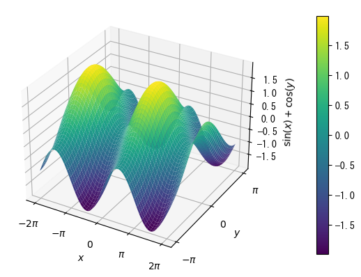
-
アニメーションはいわゆるパラパラマンガの要領で作成する
つまり、ある (短い) 時間だけグラフを表示する、という動作を繰り返す
PythonPlotの場合グラフ消去→グラフ表示を繰り返すことになる# アニメーションも3次元グラフと同様に別ウインドウで表示する # ちなみにPythonPlotでアニメーションの保存は面倒なので諦めたほうが良い pygui(true) using Printf fig = figure() ax = fig.add_subplot(1,1,1) q = pi / 4 v0 = 5.0 v0x = v0 * cos(q) v0y = v0 * sin(q) g = 9.8 t = [0.0] x = [0.0] y = [0.0] # アニメーションを表示するためのfor文 for it = 1:200 t_now = it * 0.0035 x_now = v0x * t_now y_now = v0y * t_now - 0.5 * g * t_now ^ 2 t = [t; t_now] x = [x; x_now] y = [y; y_now] # グラフの描画 # 前のグラフを一旦消去 ax.cla() # 新しいグラフのプロット ax.scatter(x_now, y_now) ax.plot(x,y) ax.set_xlabel("水平距離 [m]") ax.set_ylabel("垂直距離 [m]") # 軸の最大、最小は決めておいたほうが良い ax.set_xlim(0, 3) ax.set_ylim(0, 0.8) ax.set_title("t = " * @sprintf("%5.3f", t_now) * " [秒]") # グラフを描画し、() の中の時間 (秒) だけ待つ pause(0.05) end