-
First, import
using PythonPlot rc("font", family = "MS Gothic") -
Graph Basics
                # Securing the drawing area
                fig = figure()

                # Securing axes
                # If there is only one graph, 1,1,1 is fine.
                # This number changes when multiple graphs are arranged side by side, but this will be explained later.
                ax = fig.add_subplot(1,1,1)

                # Draw a line graph on the axis
                # Line graphs are plot, and scatter plots (without lines) are scatter
                # However, you can also draw scatter plots using plot
                ax.plot([1;4;7], [2;5;1]) # Line graph connecting (1,2),(4,5), and (7,1)

                # graph drawing
                plotshow()
                # The following line is also required for drawing in VS Code (not required for Jupyter notebook).
                PythonPlot.display_figs()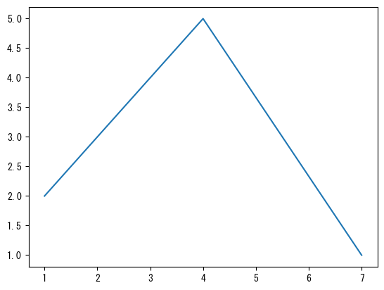
-
mark with a dot (point)
                fig = figure()
                ax = fig.add_subplot(1,1,1)

                # You can draw points at coordinates specified with the marker option
                # marker = "o" : round dot
                # marker = "x" : cross mark
                # marker = "^" : triangles
                ax.plot([1;4;7], [2;5;1], marker = "o")

                plotshow()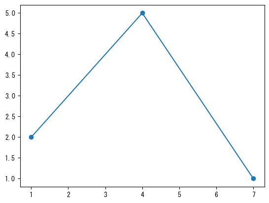
-
Change line type
                fig = figure()
                ax = fig.add_subplot(1,1,1)
                x = collect(range(0, 2pi, length = 100))

                # Line style can be changed with the linestyle option
                # linestyle = "dashed"
                # linestyle = "dotted"
                # linestyle = "dashdot"
                # linestyle = "none" : No line (can be used with markers to create a scatter plot)
                ax.plot(x, sin.(x), linestyle = "dashed")

                plotshow()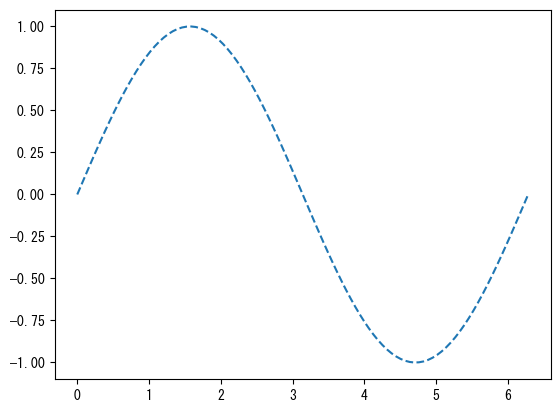
-
Change the color
                fig = figure()
                ax = fig.add_subplot(1,1,1)
                x = collect(range(0, 2pi, length = 100))

                # # You can change the color using the color option (the color of the dots will also change at the same time)
                # color = "red"
                # color = "tab:red"
                # color = "black"
                ax.plot(x, sin.(x), color = "tab:green")

                plotshow()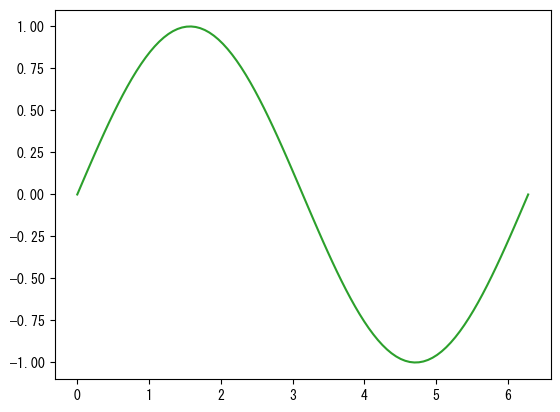
-
Name the axis
                fig = figure()
                ax = fig.add_subplot(1,1,1)
                x = collect(range(0, 2pi, length = 100))

                # ax.set_xlabel assigns a name to the x-axis
                ax.set_xlabel("name of x-axis")
                # ax.set_ylabel assigns a name to the y-axis
                ax.set_ylabel("name of y-axis")

                ax.plot(x, sin.(x))

                plotshow()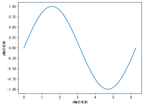
-
Name the graph
                fig = figure()
                ax = fig.add_subplot(1,1,1)
                x = collect(range(0, 2pi, length = 100))

                # ax.set_title gives the graph a name
                ax.set_title("graph of sin(x)")

                ax.plot(x, sin.(x))

                plotshow()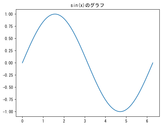
-
Set the axis range
                fig = figure()
                ax = fig.add_subplot(1,1,1)
                x = collect(range(0, 2pi, length = 100))

                # You can change the range of the x-axis with ax.set_xlim
                ax.set_xlim(0, pi)
                # You can change the range of the y-axis with ax.set_ylim
                ax.set_ylim(-5, 5)

                ax.plot(x, tan.(x))

                plotshow()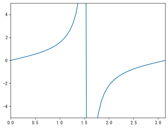
-
Set axis values
                fig = figure()
                ax = fig.add_subplot(1,1,1)
                x = collect(range(0, 2pi, length = 100))

                # ax.set_xticks (vector) allows you to display only the desired parts of the x-axis values
                ax.set_xticks(np.array([0, np.pi/2, np.pi, 3*np.pi/2, 2*np.pi]))
                # ax.set_yticks (vector) allows you to display only the desired parts of the y-axis values
                ax.set_yticks(np.array([-1, -0.5, 0, 0.5, 1]))

                ax.plot(x, sin.(x))

                plotshow()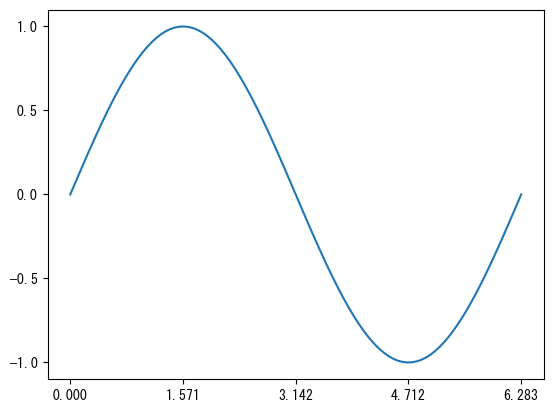
-
Set the values of the axes to whatever notation you want
                fig = figure()
                ax = fig.add_subplot(1,1,1)
                x = collect(range(0, 2pi, length = 100))

                ax.set_xticks([0; pi/2; pi; 3pi/2; 2pi])
                # ax.set_xticklabels (vector) allows you to change the display of the values set with xticks
                # The number of elements in the vectors ax.set_xticks and ax.set_xtickslabels must be the same
                ax.set_xticklabels(["0"; "π/2"; "π"; "3π/2"; "2π"])

                ax.set_yticks([-1; 0; 1])
                # ax.set_yticklabels (vector) allows you to change the display of the values set with yticks
                # The number of elements in the vectors ax.set_yticks and ax.set_ytickslabels must be the same
                ax.set_yticklabels(["ymin"; "0"; "ymax"])

                ax.plot(x, sin.(x))

                plotshow()
-
Grid against the scale
                fig = figure()
                ax = fig.add_subplot(1,1,1)
                x = collect(range(0, 2pi, length = 100))

                ax.set_xticks([0; pi/2; pi; 3pi/2; 2pi])
                ax.set_xticklabels(["0"; "π/2"; "π"; "3π/2"; "2π"])
                # ax.set_grid (axis = "x") adds a grid to the x-axis tick marks
                ax.grid(axis = "x")

                ax.set_yticks([-1; 0; 1])
                ax.set_yticklabels(["ymin"; "0"; "ymax"])
                # ax.set_grid (axis = "y") adds a grid to the y-axis tick marks
                ax.grid(axis = "y", color="tab:red", linestyle = "dashed")

                ax.plot(x, sin.(x))

                plotshow()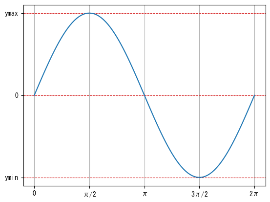
-
Attach a small scale with no numerical value
                fig = figure()
                ax = fig.add_subplot(1,1,1)
                x = collect(range(0, 2pi, length = 100))

                ax.set_xticks([0; pi/2; pi; 3pi/2; 2pi])
                ax.set_xticklabels(["0"; "π/2"; "π"; "3π/2"; "2π"])
                # minor = true option sets the minor tick mark setting
                ax.set_xticks([pi/4; 3pi/4; 5pi/4; 7pi/4], minor = true)

                ax.set_yticks([-1; 0; 1])
                ax.set_yticklabels(["ymin"; "0"; "ymax"])

                ax.plot(x, sin.(x))

                plotshow()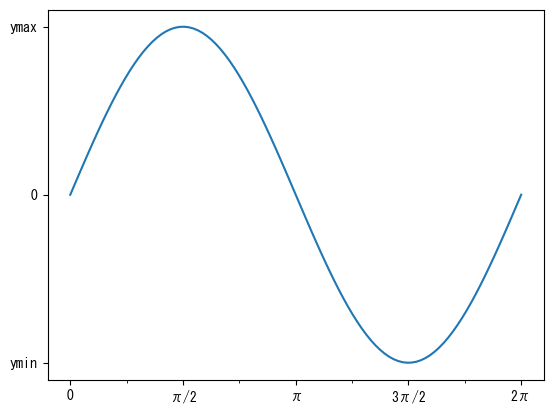
-
Attach grid to small scale
                fig = figure()
                ax = fig.add_subplot(1,1,1)
                x = collect(range(0, 2pi, length = 100))

                ax.set_xticks([0; pi/2; pi; 3pi/2; 2pi])
                ax.set_xticklabels(["0"; "π/2"; "π"; "3π/2"; "2π"])
                ax.set_xticks([pi/4; 3pi/4; 5pi/4; 7pi/4], minor = true)
                ax.grid(axis = "x")
                # which = "minor" option makes the grid for minor tick marks
                ax.grid(axis = "x", which = "minor", linestyle = "dashed")

                ax.set_yticks([-1; 0; 1])
                ax.set_yticklabels(["ymin"; "0"; "ymax"])

                ax.plot(x, sin.(x))

                plotshow()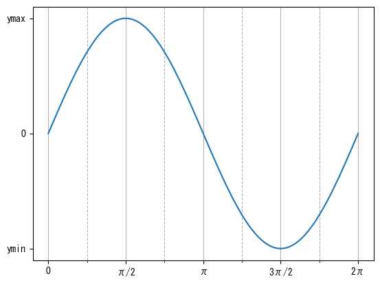
-
Same ratio of length to number on x-axis and y-axis
                fig = figure()
                ax = fig.add_subplot(1,1,1)
                x = collect(range(0, 2pi, length = 100))

                # ax.set_aspect(1) sets the ratio of the vertical and horizontal values to be the same
                ax.set_aspect(1)

                ax.plot(x, sin.(x))

                plotshow()
-
Using LaTeX for Strings
                fig = figure()
                ax = fig.add_subplot(1,1,1)
                x = collect(range(0, 2pi, length = 100))

                # By adding an L before a string, you can use LaTeX notation
                # ax.set_x(y)label, ax.set_title, ax.set_x(y)ticklabels, label (described later) etc. correspond to this
                ax.set_xlabel(L"$x$")
                ax.set_ylabel(L"$\sin(x)$")
                ax.set_title(L"graph of $\sin(x)$")

                ax.set_xticks([0; pi/2; pi; 3pi/2; 2pi])
                ax.set_xticklabels(["0"; L"$\pi/2$"; L"$\pi$"; L"$3\pi/2$"; L"$2\pi$"])

                ax.set_yticks([-1; 0; 1])
                ax.set_yticklabels([L"$y_\mathrm{min}$"; "0"; L"$y_\mathrm{max}$"])

                ax.plot(x, sin.(x))

                plotshow()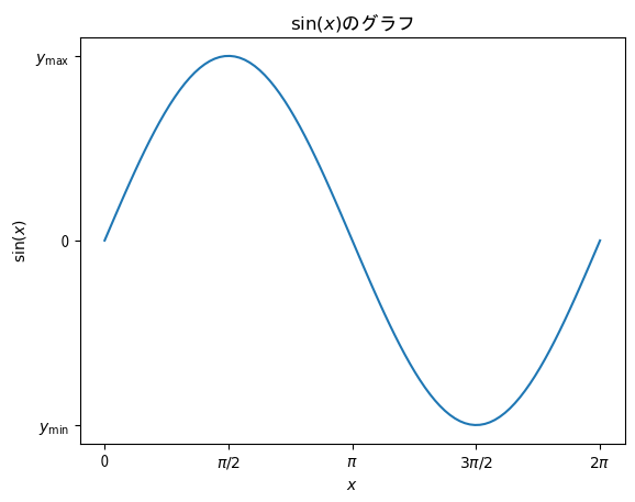
-
Graph size
                # You can change the size of the drawing area with the # figsize option
                # The default is [6.4; 4.8]
                fig = figure(figsize = [6.4; 4.8] * 0.75)
                ax = fig.add_subplot(1,1,1)
                x = collect(range(0, 2pi, length = 100))
                ax.plot(x, sin.(x))

                plotshow()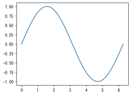
-
Saving Graphs
                fig = figure()
                ax = fig.add_subplot(1,1,1)
                x = collect(range(0, 2pi, length = 100))
                ax.plot(x, sin.(x))

                # Instead of plotshow(), use savefig("filename") to save the graph
                # By setting bbox_inches = "tight" and pad_inches = 0.1 as options, you can minimize the extra space around the image
                # Commonly used file extensions include png and pdf (the file type is automatically determined based on the file extension)
                savefig("graph.png", bbox_inches = "tight", pad_inches = 0.1)
-
Draw multiple graphs on a single axis
                fig = figure()
                ax = fig.add_subplot(1,1,1)
                x = collect(range(0, 2pi, length = 100))

                # By repeatedly using ax.plot and ax.scatter, you can draw multiple graphs on a single axis
                # The color changes automatically (of course, you can specify each color individually with the color option)
                ax.plot(x, sin.(x))
                ax.plot(x, cos.(x))

                plotshow()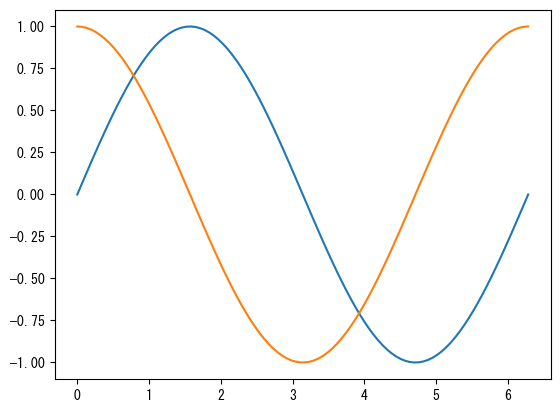
-
Mixed plot and scatter
                fig = figure()
                ax = fig.add_subplot(1,1,1)
                x1 = collect(range(0, 2pi, length = 100))
                x2 = collect(range(0, 2pi, length = 10))

                # You can also mix ax.plot and ax.scatter
                # Note that color management is separate for plot and scatter
                ax.plot(x1, sin.(x1))
                ax.scatter(x2, cos.(x2))

                plotshow()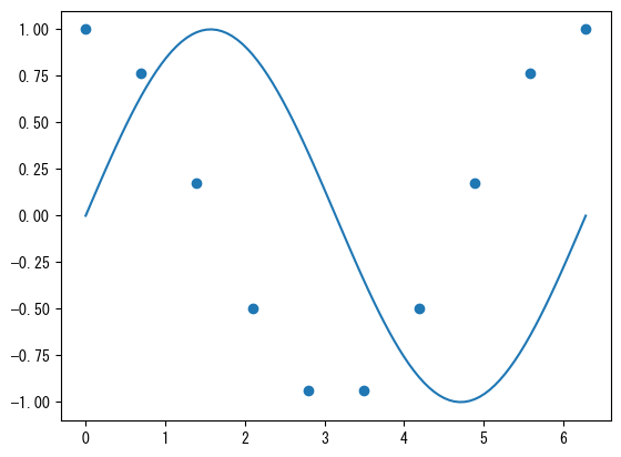
-
Show legend
                fig = figure()
                ax = fig.add_subplot(1,1,1)
                x = collect(range(0, 2pi, length = 100))

                # Name with the label option
                ax.plot(x, sin.(x), label = L"$\sin(x)$")
                ax.plot(x, cos.(x), label = L"$\cos(x)$")

                # With ax.legend(), you can display the names assigned with the label option as a legend
                ax.legend()

                plotshow()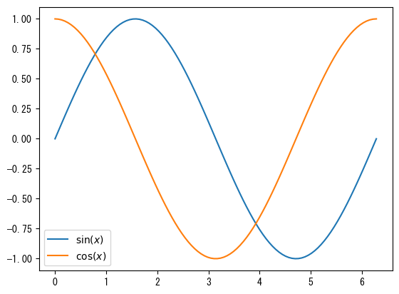
-
Legend Location
                fig = figure()
                ax = fig.add_subplot(1,1,1)
                x = collect(range(0, 2pi, length = 100))

                ax.plot(x, sin.(x), label = L"$\sin(x)$")
                ax.plot(x, sin.(x .- 2pi / 5), label = L"$\sin(x-2\pi/5)$")
                ax.plot(x, sin.(x .- 4pi / 5), label = L"$\sin(x-4\pi/5)$")
                ax.plot(x, sin.(x .- 6pi / 5), label = L"$\sin(x-6\pi/5)$")
                ax.plot(x, sin.(x .- 8pi / 5), label = L"$\sin(x-8\pi/5)$")

                # The position of the legend is adjusted automatically, but you can specify the approximate position using loc
                # "upper left"
                # "upper center"
                # "upper right"
                # "center left"
                # "center"
                # "center right"
                # "lower left"
                # "lower center"
                # "lower right"
                ax.legend(loc = "center")

                plotshow()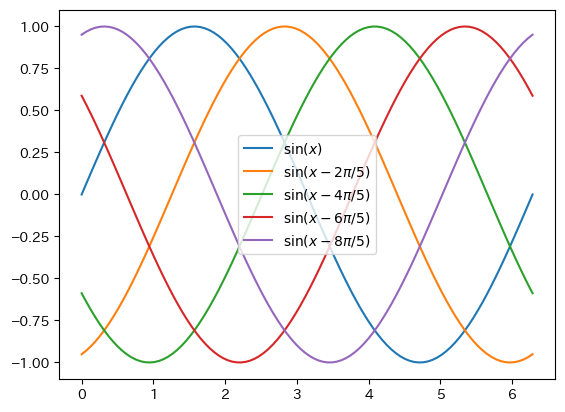
-
Detailed location of legend
                fig = figure()
                ax = fig.add_subplot(1,1,1)
                x = collect(range(0, 2pi, length = 100))

                ax.plot(x, sin.(x), label = L"$\sin(x)$")
                ax.plot(x, sin.(x .- 2pi / 5), label = L"$\sin(x-2\pi/5)$")
                ax.plot(x, sin.(x .- 4pi / 5), label = L"$\sin(x-4\pi/5)$")
                ax.plot(x, sin.(x .- 6pi / 5), label = L"$\sin(x-6\pi/5)$")
                ax.plot(x, sin.(x .- 8pi / 5), label = L"$\sin(x-8\pi/5)$")

                # You can specify the position with bbox_to_anchor. (0,0) is the lower left corner, (1,1) is the upper right corner
                # Furthermore, by specifying loc, you can set the position of the legend to bbox_to_anchor
                # Specify the number of columns with ncols

                ax.legend(bbox_to_anchor = (0.5, 1), loc = "lower center", ncols = 5)

                plotshow()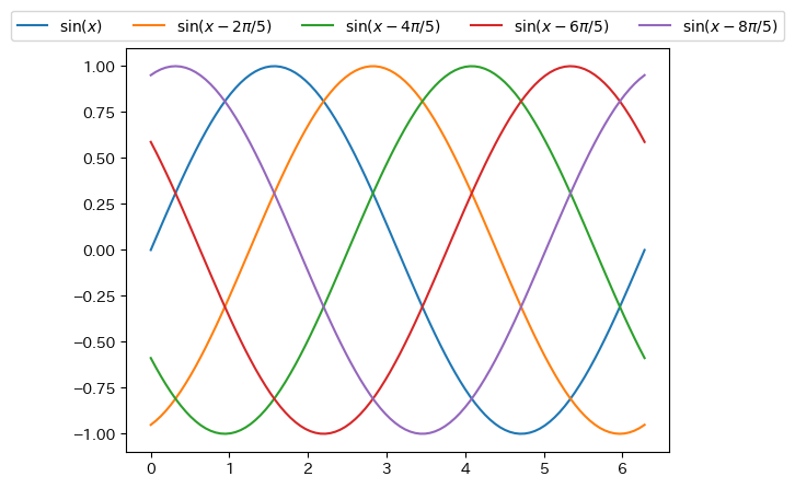
-
Different y-axis for left and right
                fig = figure()
                t = collect(range(0, 0.9, length = 100))

                # First, create a graph for the left side (normal) of the y-axis
                ax1 = fig.add_subplot(1,1,1)

                ax1.plot(t, 5 .- 9.8 * t)
                ax1.set_xlabel("time [s]")
                ax1.set_ylabel("velocity [m/s]")

                # Create a graph for the y-axis on the right side
                # Creating an axis with the y-axis on the right using twinx
                ax2 = ax1.twinx()

                # Please note that color management is separate for ax1 and ax2
                ax2.plot(t, - 4.9 * t .^ 2 + 5 * t)
                ax2.set_ylabel("height [m]")

                plotshow()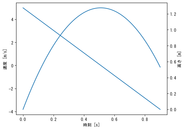
-
Different y-axis for left and right (color, legend adjustment)
                fig = figure()
                t = collect(range(0, 0.9, length = 100))

                ax1 = fig.add_subplot(1,1,1)

                ax1.plot(t, 5 .- 9.8 * t, label = "velocity (without friction) ")
                ax1.plot(t, 24.6 * exp.(- t / 2) .- 19.6, label = "velocity (with friction) ")
                ax1.set_xlabel("時刻 [s]")
                ax1.set_ylabel("velocity [m/s]")
                ax1.legend()

                ax2 = ax1.twinx()

                ax2.plot(t, - 4.9 * t .^ 2 + 5 * t, label = "height (without friction) ", color = "tab:green")
                ax2.plot(t, 49.2 * (1 .- exp.(- t / 2)) - 19.6 * t, label = "height (with friction) ", color = "tab:red")
                ax2.set_ylabel("height [m]")
                ax2.legend()

                plotshow()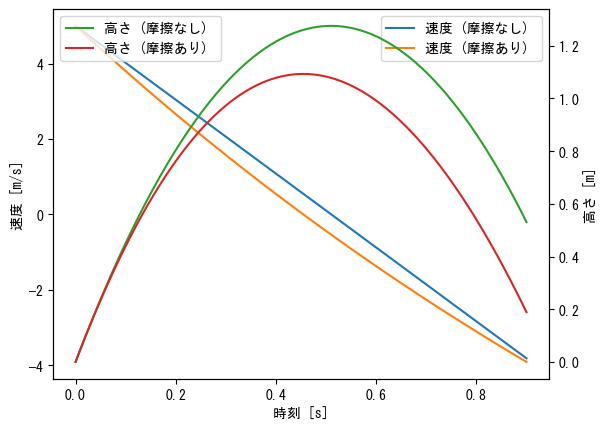
-
Multiple axes
                # Be sure to set the size of the drawing area, as multiple axes will be drawn
                fig = figure(figsize = [6.4 * 2; 4.8 * 3] * 0.8)
                x1 = collect(range(- pi, pi, length = 100))
                x2 = collect(range(-1, 1, length = 100))
                x3 = collect(range(-2, 2, length = 100))
                x4 = collect(range(1, 2, length = 100))

                # The first one when the axes are arranged in three rows and two columns
                ax = fig.add_subplot(3,2,1)
                ax.plot(x1, sin.(x1), label = L"$\sin(x)$")
                ax.plot(x1, cos.(x1), label = L"$\cos(x)$")
                ax.plot(x1, tan.(x1), label = L"$\tan(x)$")
                ax.set_ylim(-1.5, 1.5)
                ax.set_xlabel(L"$x$")
                ax.set_title("Graph of trigonometric functions")
                ax.legend()

                # The second one when the axes are arranged in three rows and two columns
                ax = fig.add_subplot(3,2,2)
                ax.plot(x3, sinh.(x3), label = L"$\sinh(x)$")
                ax.plot(x3, cosh.(x3), label = L"$\cosh(x)$")
                ax.plot(x3, tanh.(x3), label = L"$\tanh(x)$")
                ax.set_xlabel(L"$x$")
                ax.set_title("Graph of hyperbolic functions")
                ax.legend()

                # The third one when the axes are arranged in three rows and two columns
                ax = fig.add_subplot(3,2,3)
                ax.plot(x1, 1 ./ sin.(x1), label = L"$\csc(x)$")
                ax.plot(x1, 1 ./ cos.(x1), label = L"$\sec(x)$")
                ax.plot(x1, 1 ./ tan.(x1), label = L"$\cot(x)$")
                ax.set_ylim(-10, 10)
                ax.set_xlabel(L"$x$")
                ax.set_title("Graph of the reciprocal of trigonometric functions")
                ax.legend()

                # The fourth one when the axes are arranged in three rows and two columns
                ax = fig.add_subplot(3,2,4)
                ax.plot(x3, 1 ./ sinh.(x3), label = L"$\mathrm{csch}(x)$")
                ax.plot(x3, 1 ./ cosh.(x3), label = L"$\mathrm{sech}(x)$")
                ax.plot(x3, 1 ./ tanh.(x3), label = L"$\coth(x)$")
                ax.set_ylim(-4, 4)
                ax.set_xlabel(L"$x$")
                ax.set_title("Graph of the reciprocal of hyperbolic functions")
                ax.legend()

                # The fifth one when the axes are arranged in three rows and two columns
                ax = fig.add_subplot(3,2,5)
                ax.plot(x2, asin.(x2), label = L"$\sin^{-1}(x)$")
                ax.plot(x2, acos.(x2), label = L"$\cos^{-1}(x)$")
                ax.plot(x3, atan.(x3), label = L"$\tan^{-1}(x)$")
                ax.set_xlabel(L"$x$")
                ax.set_title("Graph of inverse trigonometric functions")
                ax.legend()

                # The sixth one when the axes are arranged in three rows and two columns
                ax = fig.add_subplot(3,2,6)
                ax.plot(x3, asinh.(x3), label = L"$\sinh^{-1}(x)$")
                ax.plot(x4, acosh.(x4), label = L"$\cosh^{-1}(x)$")
                ax.plot(x2, atanh.(x2), label = L"$\tanh^{-1}(x)$")
                ax.set_xlabel(L"$x$")
                ax.set_title("Graph of inverse hyperbolic functions")
                ax.legend()

                # Adjust axis spacing with subplots_adjust
                # wspace for horizontal, hspace for vertical
                subplots_adjust(wspace=0.2, hspace=0.3)

                plotshow()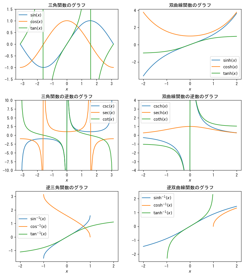
-
single-logarichmic graph
                fig = figure()
                x = collect(range(0, 5, length = 5))

                ax = fig.add_subplot(1,1,1)

                # ax.set_yscale("log") creates a semi-logarithmic graph (y-axis is logarithmic scale)
                ax.set_yscale("log")

                ax.plot(x, 5 * exp.(- 2 * x), marker = "o")
                ax.set_title("In a semi-logarithmic graph, exponential functions appear as straight lines")

                ax.set_xlabel(L"$x$")
                ax.set_ylabel(L"$5e^{-2x}$")

                plotshow()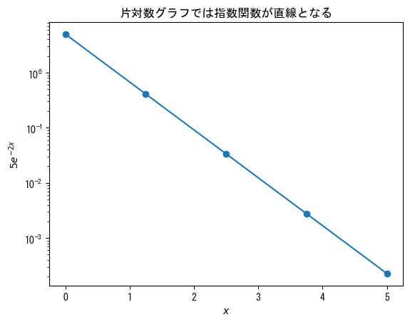
-
double-logarithmic graph
                fig = figure()
                x = collect(range(1, 100, length = 10))

                ax = fig.add_subplot(1,1,1)

                # Add ax.set_xscale("log") to create a double logarithmic graph (logarithmic scale on both the x-axis and y-axis)
                ax.set_xscale("log")
                ax.set_yscale("log")

                ax.plot(x, 10 * x .^ (- 5 / 3), marker = "o")
                ax.set_title("In a logarithmic graph, power functions become straight lines")

                ax.set_xlabel(L"$x$")
                ax.set_ylabel(L"$10x^{-5/3}$")

                plotshow()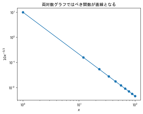
-
When using ticks (setting axis values) in a logarithmic graph, it is best to use them in conjunction with ticklabels (or else the graph may not display well).
                # On logarithmic scale graphs, minor ticks are basically displayed as they are
                # If you want to delete it, add the following description
                rc("ytick.minor", size = 0) # When the x-axis is on a logarithmic scale, use xtick.minor

                fig = figure()
                x = collect(range(0, 5, length = 5))

                ax = fig.add_subplot(1,1,1)

                ax.set_yscale("log")

                # Set the vector of values you want to set on the y-axis
                vector_y = [0.02; 0.7; 1.4; 5]
                ax.set_yticks(vector_y)
                ax.set_yticklabels(string.(vector_y))

                ax.plot(x, 5 * exp.(- 2 * x), marker = "o")

                ax.set_xlabel(L"$x$")
                ax.set_ylabel(L"$5e^{-2x}$")

                plotshow()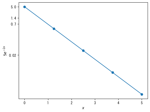
-
Basic Histogram
                using Random
                using Dates
                rng = MersenneTwister(Millisecond(now()).value)

                fig = figure()
                x = [randn(rng, 1000); 2.0 * randn(rng, 1000) .+ 5]

                ax = fig.add_subplot(1,1,1)

                # ax.hist(vector) produces a histogram
                ax.hist(x)

                ax.set_xlabel(L"$x$")
                ax.set_ylabel("histogram")

                plotshow()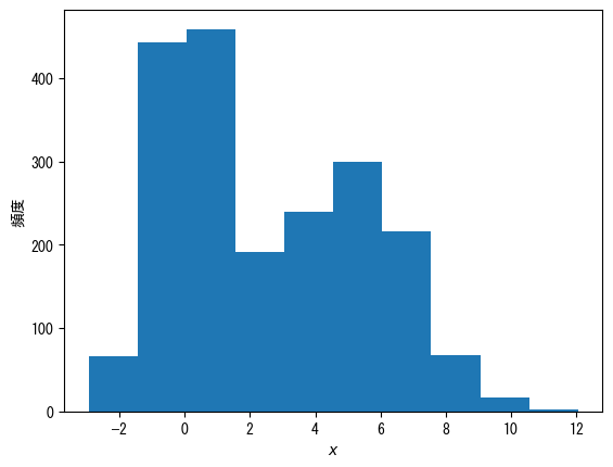
-
change the grade number
                using Random
                using Dates
                rng = MersenneTwister(Millisecond(now()).value)

                fig = figure()
                x = [randn(rng, 1000); 2.0 * randn(rng, 1000) .+ 5]

                ax = fig.add_subplot(1,1,1)

                # Specify the number of classes with the bins option
                ax.hist(x, bins = 20)

                ax.set_xlabel(L"$x$")
                ax.set_ylabel("histogram")

                plotshow()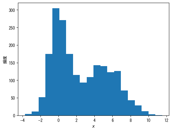
-
Make it a probability distribution, not a frequency
                using Random
                using Dates
                rng = MersenneTwister(Millisecond(now()).value)

                fig = figure()
                x = [randn(rng, 1000); 2.0 * randn(rng, 1000) .+ 5]

                ax = fig.add_subplot(1,1,1)

                # When density = true, it becomes a probability distribution rather than a frequency distribution
                ax.hist(x, bins = 20, density = true)

                ax.set_xlabel(L"$x$")
                ax.set_ylabel(L"$p(x)$")

                plotshow()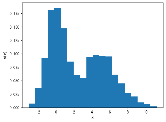
-
Bars only on the outer border (useful for displaying multiple histograms)
                using Random
                using Dates
                rng = MersenneTwister(Millisecond(now()).value)

                fig = figure()
                x1 = randn(rng, 1000)
                x2 = 2.0 * randn(rng, 1000) .+ 5
                x3 = [x1; x2]

                ax = fig.add_subplot(1,1,1)

                # When histtype = "step", only the outer frame is displayed
                ax.hist(x1, bins = 20, density = true, histtype = "step", label = L"$p_1(x)$")
                ax.hist(x2, bins = 20, density = true, histtype = "step", label = L"$p_2(x)$")
                ax.hist(x3, bins = 20, density = true, histtype = "step", label = L"$p_{1 + 2}(x)$")

                ax.set_xlabel(L"$x$")
                ax.set_ylabel(L"$p(x)$")
                ax.legend()

                plotshow()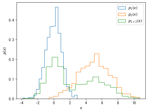
-
A note on histograms
If you want to plot something more advanced, such as a histogram of a line chart, you have to get a vector of the histogram, which can be obtained by the fit function in StatsBase, but it is quite tedious (this is where Python ( numpy) wins hands down).
Point color and point size in scatter plots by scatter
-
Specify a different vector for the color of a point in a scatterplot with scatter
                fig = figure()
                height = [172.3; 165; 179.6; 174.5; 173.8; 165.4; 164.5; 174.9; 166.8; 185]
                mass = [75.24; 55.8; 78; 71.1; 67.7; 55.4; 63.7; 77.2; 67.5; 84.6]
                fat = [21.3; 15.7; 20.1; 18.4; 17.1; 22; 32.2; 36.9; 27.6; 14.4]

                ax = fig.add_subplot(1,1,1)

                # By specifying a vector with the c option, the points will be colored according to the values in that vector
                ax.scatter(height, mass, c = fat)

                ax.set_xlabel("height [cm]")
                ax.set_ylabel("weight [kg]")

                plotshow()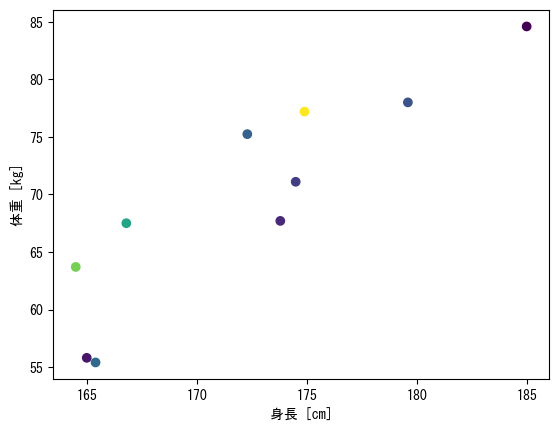
-
Display a color bar that maps colors to numerical values
                fig = figure()
                height = [172.3; 165; 179.6; 174.5; 173.8; 165.4; 164.5; 174.9; 166.8; 185]
                mass = [75.24; 55.8; 78; 71.1; 67.7; 55.4; 63.7; 77.2; 67.5; 84.6]
                fat = [21.3; 15.7; 20.1; 18.4; 17.1; 22; 32.2; 36.9; 27.6; 14.4]

                ax = fig.add_subplot(1,1,1)

                # Assign the scatter plot itself as a variable (in this case, the variable c_points)
                c_points = ax.scatter(height, mass, c = fat)

                # colorbar(c_points, ax = ax) adds a color bar
                colorbar(c_points, ax = ax)

                ax.set_xlabel("height [cm]")
                ax.set_ylabel("weight [kg]")

                plotshow()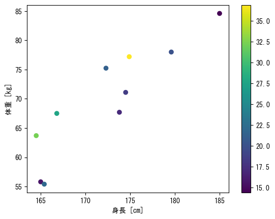
-
Option 1 for color, color bar
                fig = figure()
                height = [172.3; 165; 179.6; 174.5; 173.8; 165.4; 164.5; 174.9; 166.8; 185]
                mass = [75.24; 55.8; 78; 71.1; 67.7; 55.4; 63.7; 77.2; 67.5; 84.6]
                fat = [21.3; 15.7; 20.1; 18.4; 17.1; 22; 32.2; 36.9; 27.6; 14.4]

                ax = fig.add_subplot(1,1,1)

                # The vmax and vmin options allow you to set the maximum and minimum values for colors
                c_points = ax.scatter(height, mass, c = fat, vmin = 10, vmax = 40)

                # Color bars are named with the label option
                colorbar(c_points, ax = ax, label = "body fat [%]")

                ax.set_xlabel("height [cm]")
                ax.set_ylabel("weight [kg]")

                plotshow()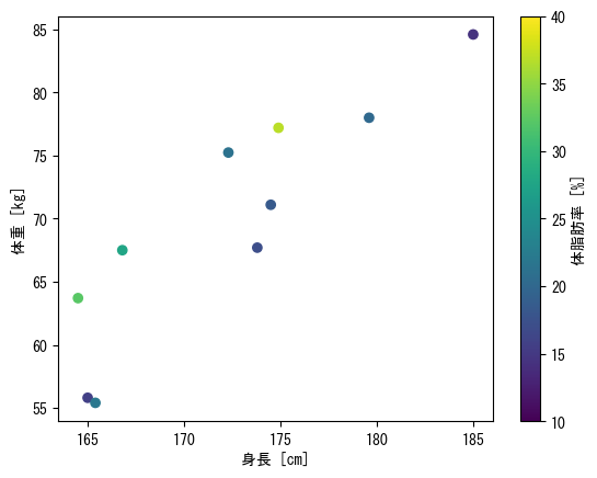
-
Option 2 for color, color bar
                fig = figure()
                height = [172.3; 165; 179.6; 174.5; 173.8; 165.4; 164.5; 174.9; 166.8; 185]
                mass = [75.24; 55.8; 78; 71.1; 67.7; 55.4; 63.7; 77.2; 67.5; 84.6]
                fat = [21.3; 15.7; 20.1; 18.4; 17.1; 22; 32.2; 36.9; 27.6; 14.4]

                ax = fig.add_subplot(1,1,1)

                # Colors can be changed with the cmap option
                # viridis : Default blue→yellow
                # jet : rainbow colors
                # hsv : periodic rainbow colors
                c_points = ax.scatter(height, mass, c = fat, cmap = get_cmap(:hsv))

                # The value set in the ticks option is displayed
                # Furthermore, assign the color bar itself to another variable (in this case, cbar), and use cbar.ax.set_yticklabels to change the display
                cbar = colorbar(c_points, ax = ax, label = "body fat [%]", ticks = [15; 25; 35])
                cbar.ax.set_yticklabels(["low"; "mid"; "high"])

                ax.set_xlabel("height [cm]")
                ax.set_ylabel("weight [kg]")

                plotshow()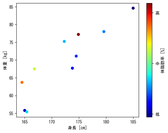
-
Dot size
                fig = figure()
                height = [172.3; 165; 179.6; 174.5; 173.8; 165.4; 164.5; 174.9; 166.8; 185]
                mass = [75.24; 55.8; 78; 71.1; 67.7; 55.4; 63.7; 77.2; 67.5; 84.6]
                fat = [21.3; 15.7; 20.1; 18.4; 17.1; 22; 32.2; 36.9; 27.6; 14.4]
                age = [27; 25; 31; 32; 28; 36; 42; 33; 54; 28]

                ax = fig.add_subplot(1,1,1)

                # You can choose the size of the dots as an option
                # (markersize for plots)
                # However, in the case of scatter, you can change the size of each point by specifying a vector in c
                c_points = ax.scatter(height, mass, c = fat, s = age * 4)

                cbar = colorbar(c_points, ax = ax, label = "body fat [%]", ticks = [15; 25; 35])
                cbar.ax.set_yticklabels(["low"; "mid"; "high"])

                ax.set_xlabel("height [cm]")
                ax.set_ylabel("weight [kg]")
                ax.set_title("Marker size corresponds to age")

                plotshow()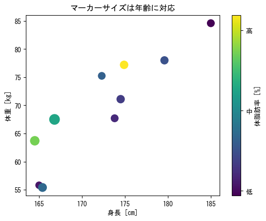
-
imshow is like displaying a matrix as you see it
                fig = figure()

                matrix = [2 3 0 0;
                     1 2 3 0;
                     0 1 2 3;]

                ax = fig.add_subplot(1,1,1)

                # min, vmax, and cmap options can also be used (see scatter)
                c_matrix = ax.imshow(matrix)

                # Color bars can also be used
                # label and ticks options are also available
                colorbar(c_matrix, ax = ax, label = "matrix value")

                ax.set_xlabel("column")
                ax.set_ylabel("row")

                plotshow()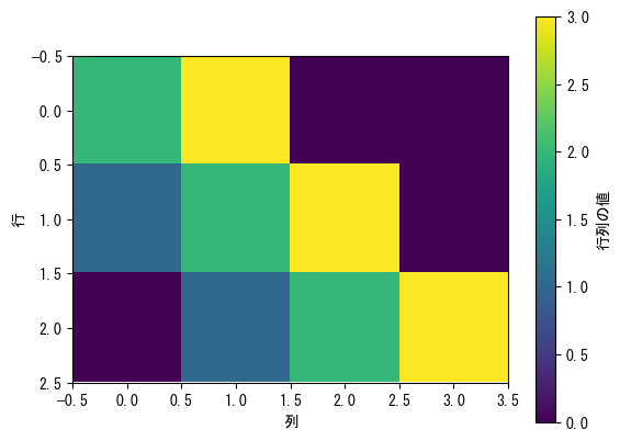
-
If the height of the color bar is uncomfortable
                fig = figure()

                matrix = [2 3 0 0;
                     1 2 3 0;
                     0 1 2 3;]

                ax = fig.add_subplot(1,1,1)

                c_matrix = ax.imshow(matrix)

                # The quickest way is to set fraction = (row size) / (column size) * 0.046 and pad = 0.04.
                colorbar(c_matrix, ax = ax, label = "matrix value", fraction = 3 / 4 * 0.046, pad = 0.04)

                ax.set_xlabel("column")
                ax.set_ylabel("row")

                plotshow()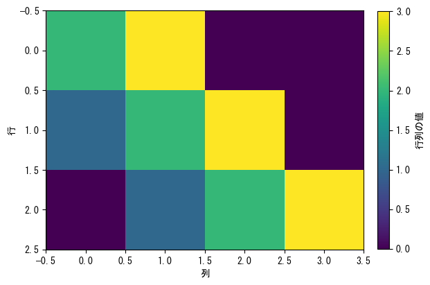
-
pcolor is an image like contour lines, where x and y coordinates can be specified
However, if nothing is specified, the line direction of the matrix will be x and the columns will be y direction (opposite to imshow)fig = figure() # Create a vector for the values of x and y x = collect(range(- 2pi, 2pi, length = 100)) y = collect(range(- pi, pi, length = 100)) # Set y as the vector (horizontal vector) y = transpose(y) # Convert x and y into a matrix x, y = x .+ 0 * y, 0 * x .+ y ax = fig.add_subplot(1,1,1) # The basic format is ax.pcolor(matrix specifying x coordinates, matrix specifying y coordinates, matrix for heat map, shading = "auto") # The vmin, vmax, and cmap options can also be used (see scatter) c_pcolor = ax.pcolor(x, y, sin.(x .+ y), shading = "auto") # Color bars can also be used # label and ticks options are also available colorbar(c_pcolor, ax = ax, label = L"$\sin(x+y)$") ax.set_xlabel(L"$x$") ax.set_ylabel(L"$y$") ax.set_xticks([-2pi; -pi; 0; pi; 2pi]) ax.set_xticklabels([L"$-2\pi$"; L"$-\pi$"; L"$0$"; L"$\pi$"; L"$2\pi$"]) ax.set_yticks([-pi; 0; pi]) ax.set_yticklabels([L"$-\pi$"; L"$0$"; L"$\pi$"]) plotshow()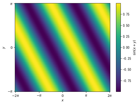
-
Basics of 3D Graphs
                # 3D graphs are basically convenient because you can freely change the viewpoint using the mouse
                # To make this possible, it is necessary to draw the graph in a separate window
                # If you set pygui(true), the graph will open in a separate window
                # Conversely, if you set pygui to false, the graph will be displayed on the Jupyter notebook
                pygui(true)

                fig = figure()
                t = collect(range(0, 2pi, length = 100))
                x = sin.(t)
                y = cos.(t)
                z = t + sin.(2t)

                # Adding "3d" to projection makes it a 3D graph
                ax = fig.add_subplot(1,1,1, projection = "3d")

                # A plot is a 3D line graph that also requires a vector for the z-coordinate
                ax.plot(x, y, z)

                # ax.set_zlabel, ax.set_zticks, ax.set_zticklabels, and ax.set_zlim can also be used
                ax.set_xlabel(L"$x = \sin(t)$")
                ax.set_ylabel(L"$y = \cos(t)$")
                ax.set_zlabel(L"$z = t + \sin(2t)$")

                plotshow()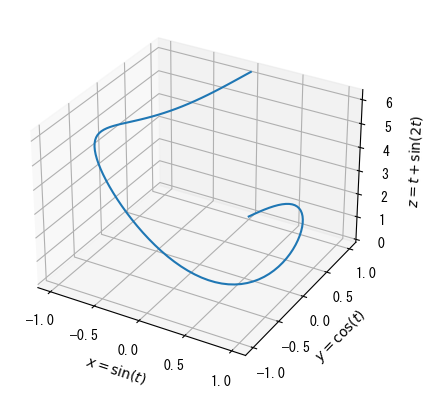
-
Dispersal Chart
                pygui(true)

                fig = figure()
                age = [27; 25; 31; 32; 28; 36; 42; 33; 54; 28]
                height = [172.3; 165; 179.6; 174.5; 173.8; 165.4; 164.5; 174.9; 166.8; 185]
                mass = [75.24; 55.8; 78; 71.1; 67.7; 55.4; 63.7; 77.2; 67.5; 84.6]
                fat = [21.3; 15.7; 20.1; 18.4; 17.1; 22; 32.2; 36.9; 27.6; 14.4]

                ax = fig.add_subplot(1,1,1, projection = "3d")

                # 3D scatter can specify vectors corresponding to colors in the same way as 2D scatter
                c_points = ax.scatter(height, mass, fat, c = age)

                # The color bars are close to the graph when set to default, so it is better to move them away a little using the pad option
                colorbar(c_points, ax = ax, label = "age", pad = 0.15)

                ax.set_xlabel("height [cm]")
                ax.set_ylabel("weight [kg]")
                ax.set_zlabel("body fat [%]")

                plotshow()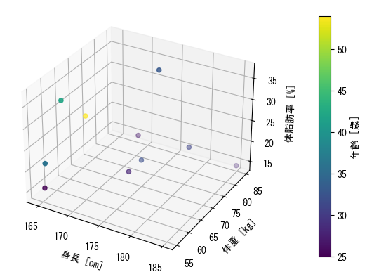
-
Curved surface (wireframe): alternative to pcolor
                pygui(true)

                fig = figure()

                x = collect(range(- 2pi, 2pi, length = 100))
                y = collect(range(- pi, pi, length = 100))

                y = transpose(y)

                x, y = x .+ 0 * y, 0 * x .+ y

                ax = fig.add_subplot(1,1,1, projection = "3d")

                # Displaying curved surfaces with ax.plot_wireframe
                ax.plot_wireframe(x, y, sin.(x) + cos.(y))

                ax.set_xlabel(L"$x$")
                ax.set_ylabel(L"$y$")
                ax.set_zlabel(L"$\sin(x)+\cos(y)$")

                ax.set_xticks([-2pi; -pi; 0; pi; 2pi])
                ax.set_xticklabels([L"$-2\pi$"; L"$-\pi$"; L"$0$"; L"$\pi$"; L"$2\pi$"])
                ax.set_yticks([-pi; 0; pi])
                ax.set_yticklabels([L"$-\pi$"; L"$0$"; L"$\pi$"])

                plotshow()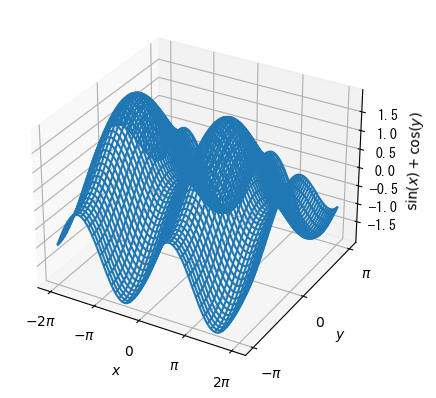
-
colored surface
                pygui(true)

                fig = figure()

                x = collect(range(- 2pi, 2pi, length = 100))
                y = collect(range(- pi, pi, length = 100))

                y = transpose(y)

                x, y = x .+ 0 * y, 0 * x .+ y

                ax = fig.add_subplot(1,1,1, projection = "3d")

                # Color-coded surface display with ax.plot_surface with cmap option
                c_surface = ax.plot_surface(x, y, sin.(x) + cos.(y), cmap = get_cmap(:viridis))

                colorbar(c_surface, ax = ax, pad = 0.15)

                ax.set_xlabel(L"$x$")
                ax.set_ylabel(L"$y$")
                ax.set_zlabel(L"$\sin(x)+\cos(y)$")

                ax.set_xticks([-2pi; -pi; 0; pi; 2pi])
                ax.set_xticklabels([L"$-2\pi$"; L"$-\pi$"; L"$0$"; L"$\pi$"; L"$2\pi$"])
                ax.set_yticks([-pi; 0; pi])
                ax.set_yticklabels([L"$-\pi$"; L"$0$"; L"$\pi$"])

                plotshow()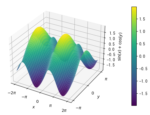
-
The animation is created in the manner of a so-called flipbook.
That is, the graph is displayed for a certain (short) amount of time, and the action is repeated.
In the case of PythonPlot, the graph is repeatedly erased and then displayed.# Animations are displayed in a separate window, similar to 3D graphs # Incidentally, saving animations in PythonPlot is troublesome, so it is better to give up on that pygui(true) using Printf fig = figure() ax = fig.add_subplot(1,1,1) q = pi / 4 v0 = 5.0 v0x = v0 * cos(q) v0y = v0 * sin(q) g = 9.8 t = [0.0] x = [0.0] y = [0.0] # For loop to display animation for it = 1:200 t_now = it * 0.0035 x_now = v0x * t_now y_now = v0y * t_now - 0.5 * g * t_now ^ 2 t = [t; t_now] x = [x; x_now] y = [y; y_now] # Graph drawing # Delete the previous graph ax.cla() # Plotting a new graph ax.scatter(x_now, y_now) ax.plot(x,y) ax.set_xlabel("horizontal distance [m]") ax.set_ylabel("vertical distance [m]") # It is better to decide the maximum and minimum values for the axis in advance ax.set_xlim(0, 3) ax.set_ylim(0, 0.8) ax.set_title("t = " * @sprintf("%5.3f", t_now) * " [sec]") # Draw a graph and wait for the time (seconds) specified in () pause(0.05) end